QUESTION IMAGE
Question
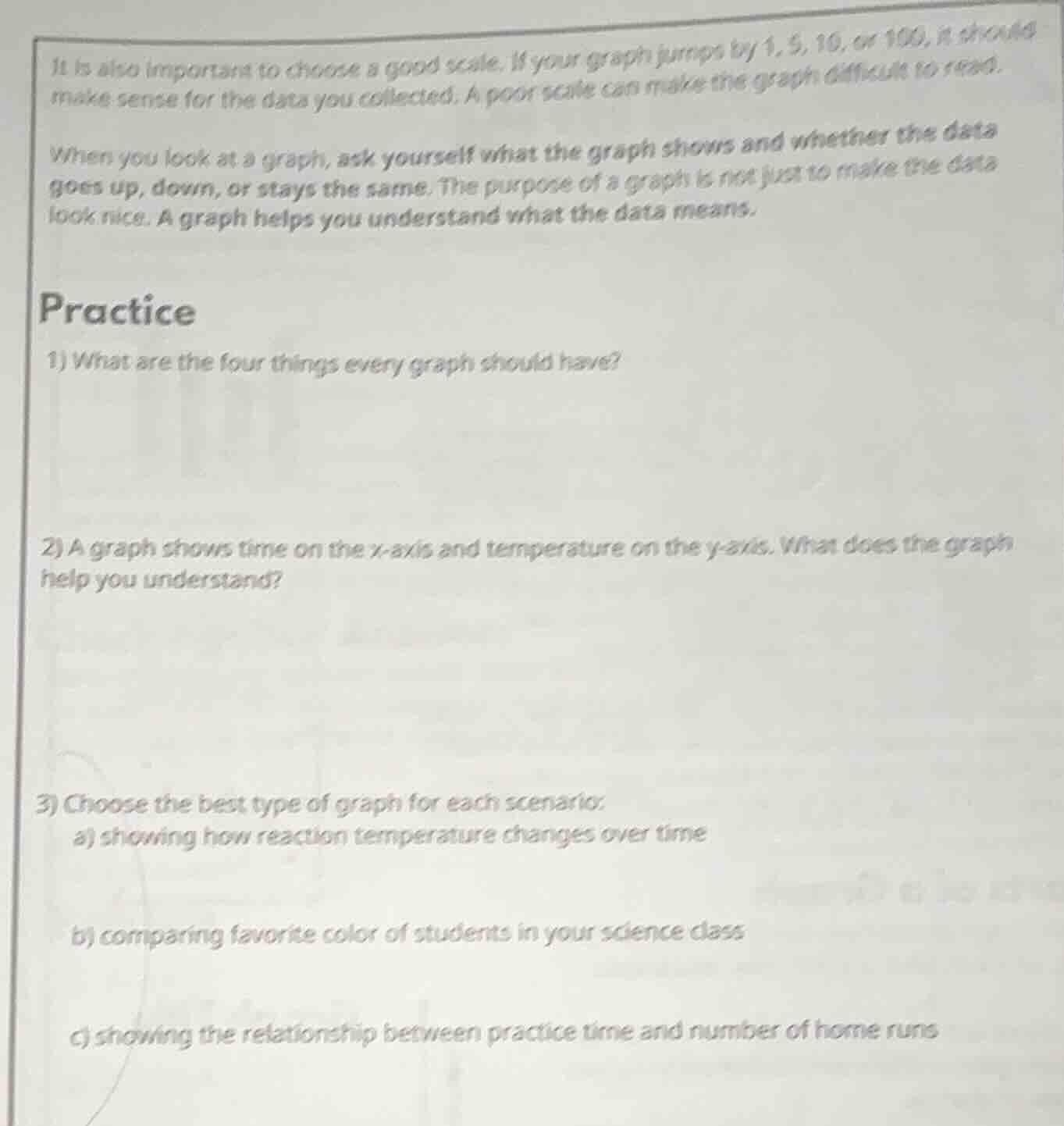
it is also important to choose a good scale. if your graph jumps by 1, 5, 10, or 100, it should make sense for the data you collected. a poor scale can make the graph difficult to read.
when you look at a graph, ask yourself what the graph shows and whether the data goes up, down, or stays the same. the purpose of a graph is not just to make the data look nice. a graph helps you understand what the data means.
practice
- what are the four things every graph should have?
- a graph shows time on the x-axis and temperature on the y-axis. what does the graph help you understand?
- choose the best type of graph for each scenario:
a) showing how reaction temperature changes over time
b) comparing favorite color of students in your science class
c) showing the relationship between practice time and number of home runs
Identify essential components of a graph
The four fundamental components that every scientific graph must include to be complete and readable are:
- A descriptive title.
- A labeled x-axis (independent variable) with units.
- A labeled y-axis (dependent variable) with units.
- An appropriate, consistent scale with uniform intervals.
Analyze the relationship of temperature over time
A graph with time on the x-axis and temperature on the y-axis displays how temperature changes as time progresses. This helps us understand the rate of temperature change, trends (whether it is heating up, cooling down, or remaining constant), and the direct relationship between time and temperature.
Select the optimal graph type for each scenario
- a) Reaction temperature over time: A line graph is best for showing continuous changes and trends over time.
- b) Comparing favorite colors: A bar graph is best for comparing discrete, non-numerical categories (colors).
- c) Relationship between practice time and home runs: A scatter plot is best for showing the relationship or correlation between two numerical variables.

Snap & solve any problem in the app
Get step-by-step solutions on Sovi AI
Photo-based solutions with guided steps
Explore more problems and detailed explanations
Question 1
- Title
- Label on the x-axis (with units)
- Label on the y-axis (with units)
- Consistent scale/intervals
Question 2
It helps you understand how temperature changes over time (the relationship between time and temperature, such as heating or cooling trends).
Question 3
a) Line graph
b) Bar graph
c) Scatter plot