QUESTION IMAGE
Question
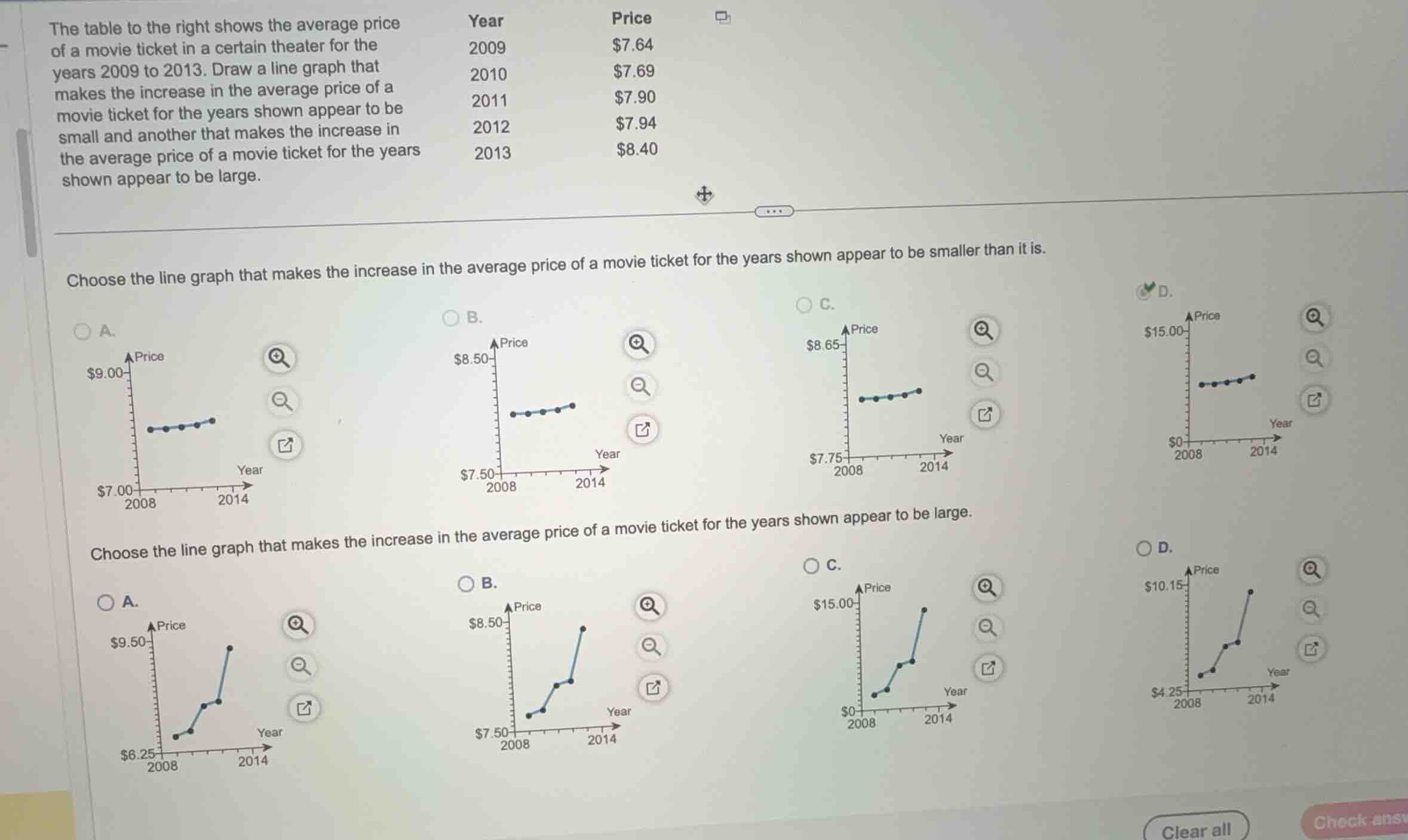
the table to the right shows the average price of a movie ticket in a certain theater for the years 2009 to 2013. draw a line graph that makes the increase in the average price of a movie ticket for the years shown appear to be small and another that makes the increase in the average price of a movie ticket for the years shown appear to be large.
year price
2009 $7.64
2010 $7.69
2011 $7.90
2012 $7.94
2013 $8.40
choose the line graph that makes the increase in the average price of a movie ticket for the years shown appear to be smaller than it is.
choose the line graph that makes the increase in the average price of a movie ticket for the years shown appear to be large.
Analyze scale distortion effects
The visual perception of a trend in a line graph is heavily influenced by the scale of the vertical axis (y-axis).
- To make an increase appear smaller (flatter slope), we should use a vertical axis with a very wide range (large interval between the minimum and maximum values). This compresses the vertical variation of the data points.
- To make an increase appear large (steeper slope), we should use a vertical axis with a very narrow range that tightly hugs the data points. This stretches the vertical variation, making small changes look dramatic.
Evaluate the first question
The first question asks to choose the line graph that makes the increase in the average price appear smaller than it is.
- The data ranges from a minimum of \(\$7.64\) to a maximum of \(\$8.40\), a total change of \(\$0.76\).
- Let's look at the y-axis ranges for the options in the first set:
- A: Range is from \(\$7.00\) to \(\$9.00\) (span of \(\$2.00\)).
- B: Range is from \(\$7.50\) to \(\$8.50\) (span of \(\$1.00\)).
- C: Range is from \(\$7.75\) to \(\$8.65\) (span of \(\$0.90\)).
- D: Range is from \(\$0\) to \(\$15.00\) (span of \(\$15.00\)).
- Graph D has the largest vertical scale span (\(\$15.00\)), which compresses the \(\$0.76\) increase into a nearly horizontal, flat line. Thus, D makes the increase look the smallest.
Evaluate the second question
The second question asks to choose the line graph that makes the increase in the average price appear large.
- We want a narrow y-axis range that is close to the actual data range (\(\$7.64\) to \(\$8.40\)) to maximize the visual slope.
- Let's look at the y-axis ranges for the options in the second set:
- A: Range is from \(\$6.25\) to \(\$9.50\) (span of \(\$3.25\)).
- B: Range is from \(\$7.50\) to \(\$8.50\) (span of \(\$1.00\)).
- C: Range is from \(\$0\) to \(\$15.00\) (span of \(\$15.00\)).
- D: Range is from \(\$4.25\) to \(\$10.15\) (span of \(\$5.90\)).
- Graph B has the narrowest vertical scale span (\(\$1.00\)), which stretches the \(\$0.76\) increase vertically, making the slope look very steep and the increase appear large.

Snap & solve any problem in the app
Get step-by-step solutions on Sovi AI
Photo-based solutions with guided steps
Explore more problems and detailed explanations
Question 1
- (A) Range $7.00 to $9.00
- (B) Range $7.50 to $8.50
- (C) Range $7.75 to $8.65
- (D) Range $0 to $15.00 (Correct answer)
Question 2
- (A) Range $6.25 to $9.50
- (B) Range $7.50 to $8.50 (Correct answer)
- (C) Range $0 to $15.00
- (D) Range $4.25 to $10.15