QUESTION IMAGE
Question
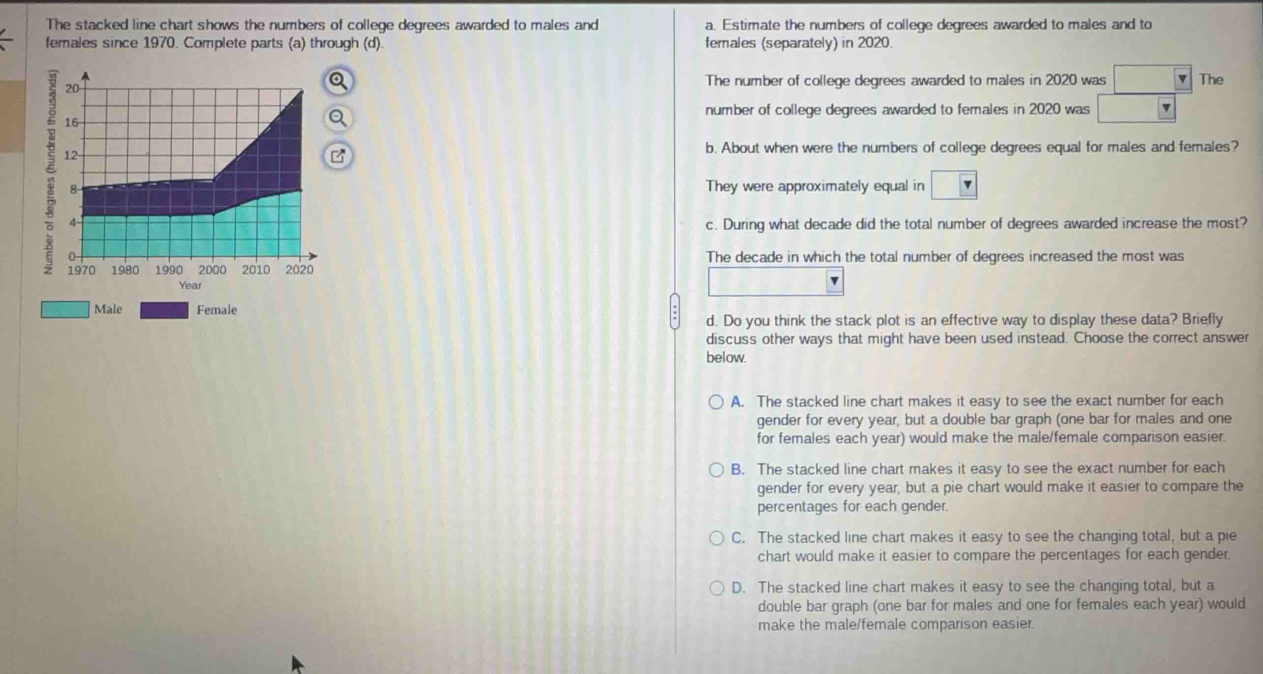
the stacked line chart shows the numbers of college degrees awarded to males and females since 1970. complete parts (a) through (d).
a. estimate the numbers of college degrees awarded to males and to females (separately) in 2020.
the number of college degrees awarded to males in 2020 was the number of college degrees awarded to females in 2020 was
b. about when were the numbers of college degrees equal for males and females?
they were approximately equal in
c. during what decade did the total number of degrees awarded increase the most?
the decade in which the total number of degrees increased the most was
d. do you think the stack plot is an effective way to display these data? briefly discuss other ways that might have been used instead. choose the correct answer below.
a. the stacked line chart makes it easy to see the exact number for each gender for every year, but a double bar graph (one bar for males and one for females each year) would make the male/female comparison easier.
b. the stacked line chart makes it easy to see the exact number for each gender for every year, but a pie chart would make it easier to compare the percentages for each gender.
c. the stacked line chart makes it easy to see the changing total, but a pie chart would make it easier to compare the percentages for each gender.
d. the stacked line chart makes it easy to see the changing total, but a double bar graph (one bar for males and one for females each year) would make the male/female comparison easier.
Read values for 2020 from the stacked line chart
Determine when degrees were equal and find the decade of greatest increase
Evaluate the effectiveness of the stacked line chart

Snap & solve any problem in the app
Get step-by-step solutions on Sovi AI
Photo-based solutions with guided steps
Explore more problems and detailed explanations
Part a
The number of college degrees awarded to males in 2020 was 800,000 (or 8 hundred thousand).
The number of college degrees awarded to females in 2020 was 1,200,000 (or 12 hundred thousand).
Part b
They were approximately equal in 2000 (since the male line is at 5 hundred thousand and the total is at 10 hundred thousand, meaning both are 5 hundred thousand).
Part c
The decade in which the total number of degrees increased the most was 2010–2020 (increasing from 14 hundred thousand to 20 hundred thousand).
Part d
- D. The stacked line chart makes it easy to see the changing total, but a double bar graph (one bar for males and one for females each year) would make the male/female comparison easier. (Correct answer)
- A. The stacked line chart makes it easy to see the exact number for each gender for every year, but a double bar graph (one bar for males and one for females each year) would make the male/female comparison easier.
- B. The stacked line chart makes it easy to see the exact number for each gender for every year, but a pie chart would make it easier to compare the percentages for each gender.
- C. The stacked line chart makes it easy to see the changing total, but a pie chart would make it easier to compare the percentages for each gender.