QUESTION IMAGE
Question
use a time series chart to display the data shown in the table. the table represents the percentages of the gross domestic product (gdp) of a country that comes from the manufacturing sector.
click the icon to view the gross domestic product data.
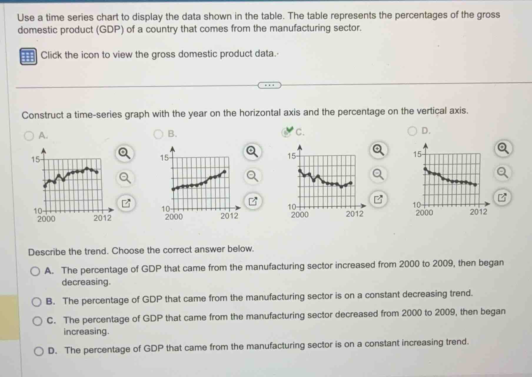
construct a time-series graph with the year on the horizontal axis and the percentage on the vertical axis.
describe the trend. choose the correct answer below.
a. the percentage of gdp that came from the manufacturing sector increased from 2000 to 2009, then began decreasing.
b. the percentage of gdp that came from the manufacturing sector is on a constant decreasing trend.
c. the percentage of gdp that came from the manufacturing sector decreased from 2000 to 2009, then began increasing.
d. the percentage of gdp that came from the manufacturing sector is on a constant increasing trend.
Identify the correct time-series graph
The selected correct graph is option C, which shows the percentage of GDP from the manufacturing sector on the vertical axis (ranging from 10% to 15%) and the year on the horizontal axis (from 2000 to 2012). Looking at the curve in graph C:
- The value starts around 13.5% in 2000.
- It generally decreases, reaching its lowest point around 2009 (near 11%).
- After 2009, the curve begins to rise slightly up to 2012.
Analyze the trend description options
- Option A states the percentage increased from 2000 to 2009, then decreased. This is the opposite of graph C.
- Option B states it is on a constant decreasing trend. This is incorrect because it rises after 2009.
- Option C states the percentage decreased from 2000 to 2009, then began increasing. This perfectly matches the visual trend shown in graph C.
- Option D states it is on a constant increasing trend. This is incorrect.

Snap & solve any problem in the app
Get step-by-step solutions on Sovi AI
Photo-based solutions with guided steps
Explore more problems and detailed explanations
Question 1
- (A) Graph showing an overall increasing trend with fluctuations, peaking around 2009 before a slight drop.
- (B) Graph showing a steady, smooth upward trend from 2000 to 2012.
- (C) Graph showing a downward trend from 2000 to 2009, followed by a slight upward turn from 2009 to 2012. (Correct answer)
- (D) Graph showing a continuous downward trend from 2000 to 2012.
Question 2
- (A) The percentage of GDP that came from the manufacturing sector increased from 2000 to 2009, then began decreasing.
- (B) The percentage of GDP that came from the manufacturing sector is on a constant decreasing trend.</mcq-correct>
- (C) The percentage of GDP that came from the manufacturing sector decreased from 2000 to 2009, then began increasing. (Correct answer)
<mcq-option>(D) The percentage of GDP that came from the manufacturing sector is on a constant increasing trend.