QUESTION IMAGE
Question
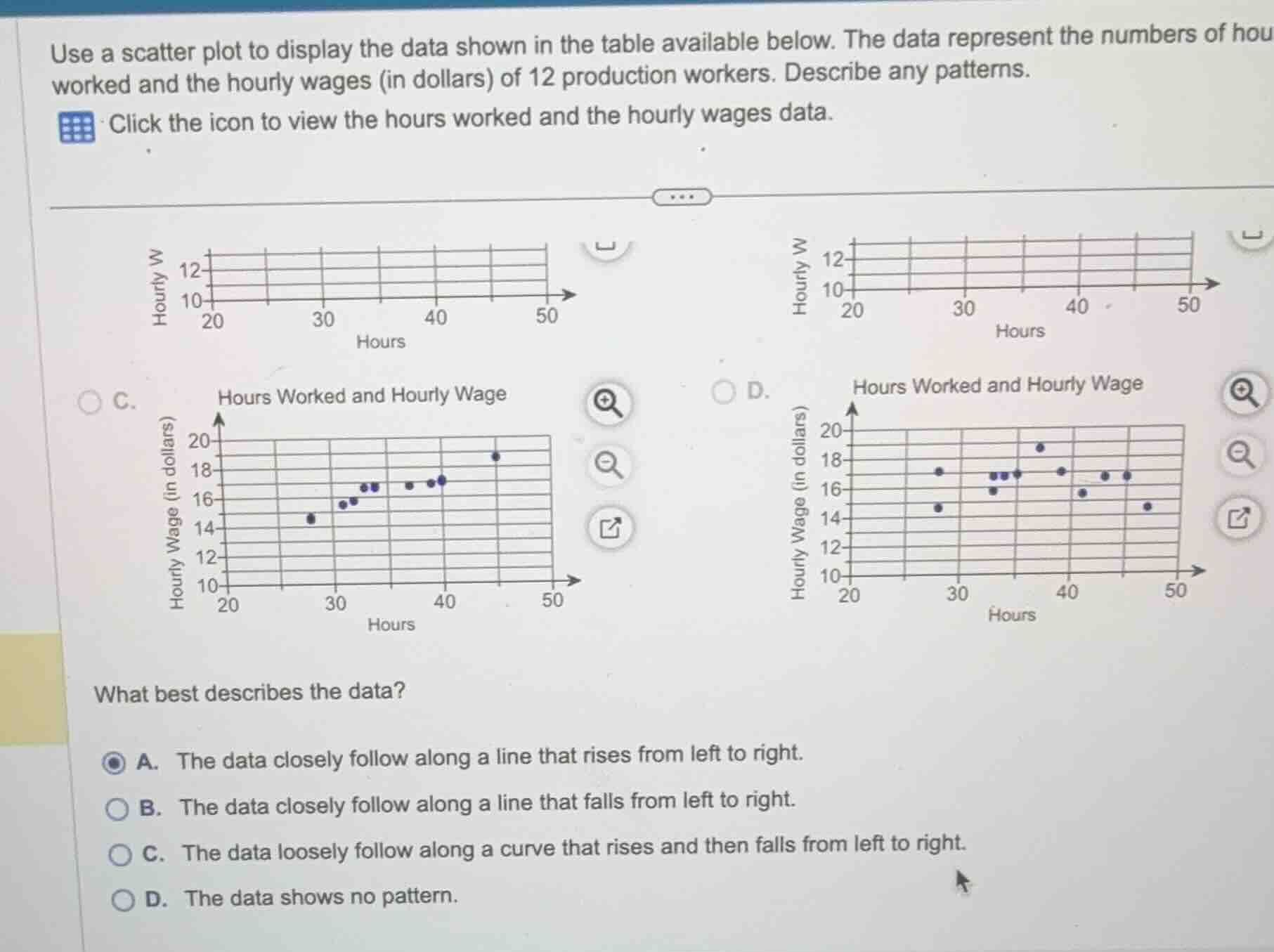
use a scatter plot to display the data shown in the table available below. the data represent the numbers of hours worked and the hourly wages (in dollars) of 12 production workers. describe any patterns.
click the icon to view the hours worked and the hourly wages data.
what best describes the data?
a. the data closely follow along a line that rises from left to right.
b. the data closely follow along a line that falls from left to right.
c. the data loosely follow along a curve that rises and then falls from left to right.
d. the data shows no pattern.
Analyze the trend in the scatter plots
Looking at the scatter plots (specifically option C, which shows a clear positive linear trend), as the hours worked (horizontal axis) increase from 20 to 50, the hourly wage (vertical axis) generally increases from around \$14 to \$19.
Evaluate the description choices
- Option A states that the data closely follow along a line that rises from left to right. This matches a positive linear correlation, which is visible in the rising trend of the plotted points.
- Option B describes a falling line (negative correlation), which is incorrect.
- Option C describes a curve that rises and then falls, which is incorrect.
- Option D describes no pattern, which is incorrect because there is a clear upward trend.

Snap & solve any problem in the app
Get step-by-step solutions on Sovi AI
Photo-based solutions with guided steps
Explore more problems and detailed explanations
- A. The data closely follow along a line that rises from left to right. (Correct answer)
- B. The data closely follow along a line that falls from left to right.
- C. The data loosely follow along a curve that rises and then falls from left to right.
- D. The data shows no pattern.