QUESTION IMAGE
Question
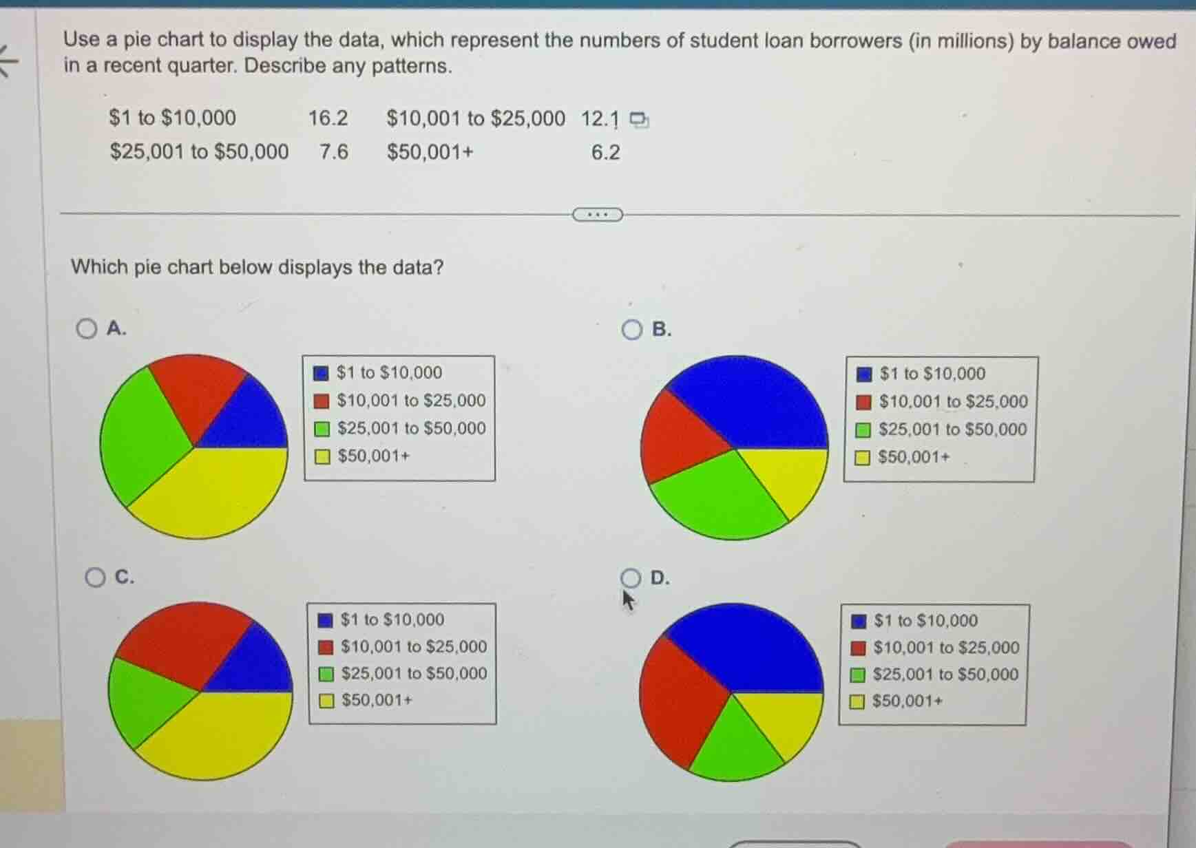
use a pie chart to display the data, which represent the numbers of student loan borrowers (in millions) by balance owed in a recent quarter. describe any patterns.
\\$1 to \\$10,000: 16.2
\\$10,001 to \\$25,000: 12.1
\\$25,001 to \\$50,000: 7.6
\\$50,001+: 6.2
which pie chart below displays the data?
a.
b.
c.
d.
Calculate total value and relative percentages
$$
LATEXBLOCK0
$$
Compare sector sizes with options
- Blue (largest sector, \(\approx 38.5\%\)): Must be slightly more than a third of the circle.
- Red (second largest, \(\approx 28.7\%\)): Must be slightly more than a quarter of the circle.
- Green (third largest, \(\approx 18.1\%\)): Must be smaller than Red.
- Yellow (smallest sector, \(\approx 14.7\%\)): Must be the smallest slice.
Identify the correct chart
- In Option A: Yellow is the largest sector, which is incorrect.
- In Option B: Blue is the largest, followed by Green, which is incorrect (Red should be larger than Green).
- In Option C: Green is the largest, which is incorrect.
- In Option D: Blue is the largest (\(\approx 38.5\%\)), Red is second largest (\(\approx 28.7\%\)), Green is third (\(\approx 18.1\%\)), and Yellow is the smallest (\(\approx 14.7\%\)). This matches our calculated proportions.

Snap & solve any problem in the app
Get step-by-step solutions on Sovi AI
Photo-based solutions with guided steps
Explore more problems and detailed explanations
- (A) Yellow is the largest sector, followed by Green, Red, and Blue.
- (B) Blue is the largest sector, followed by Green, Red, and Yellow.
- (C) Green is the largest sector, followed by Yellow, Red, and Blue.
- (D) Blue is the largest sector, followed by Red, Green, and Yellow. (Correct answer)