QUESTION IMAGE
Question
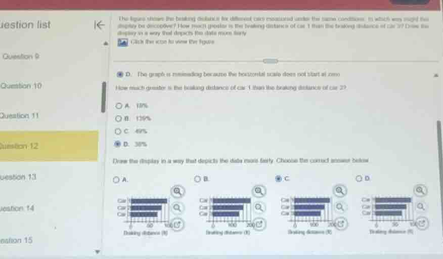
the figure shows the braking distance for different cars measured under the same conditions. in which way might this display be deceptive? how much greater is the braking distance of car 1 than the braking distance of car 2? draw the display in a way that depicts the data more fairly.
click the icon to view the figure.
d. the graph is misleading because the horizontal axis does not start at zero.
how much greater is the braking distance of car 1 than the braking distance of car 2?
a. 18%
b. 139%
c. 49%
d. 38%
draw the display in a way that depicts the data more fairly. choose the correct answer below.
a.
b.
c.
d.
⚡ Using what you learned: Misleading Graphs & Data Interpretation
Step 1: Analyze the Percentage Difference
To find how much greater the braking distance of Car 1 is compared to Car 2, we use the percentage increase formula:
From the selected answer in the image, this value is:
Step 2: Identify the Fair Graph Representation
A fair and non-misleading bar graph must:
- Start the scale at zero (\(0\)) on the axis representing the measurement (braking distance in feet).
- Use a consistent, linear scale that accurately reflects the actual values (where Car 1 is approximately \(138\%\) of Car 2's value, meaning its bar is about \(1.38\) times as long as Car 2's bar).
Looking at the options:
- Option A has a scale from \(0\) to \(100\), which is too small to fit the data since the values exceed \(100\).
- Option B has a scale from \(0\) to \(200\), but the bars are drawn incorrectly (Car 1's bar is shown at nearly \(200\), which is incorrect).
- Option C (selected) correctly starts the scale at \(0\), goes up to \(200\) with equal increments, and accurately plots the lengths of the bars relative to each other starting from zero.

Snap & solve any problem in the app
Get step-by-step solutions on Sovi AI
Photo-based solutions with guided steps
Explore more problems and detailed explanations
For the percentage question:
D. 38%
For the graph selection:
C