QUESTION IMAGE
Question
15 multiple choice 1 point
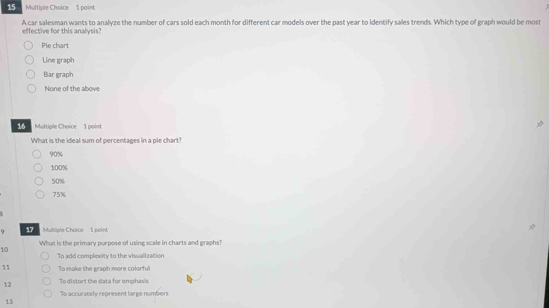
a car salesman wants to analyze the number of cars sold each month for different car models over the past year to identify sales trends. which type of graph would be most effective for this analysis?
pie chart
line graph
bar graph
none of the above
16 multiple choice 1 point
what is the ideal sum of percentages in a pie chart?
90%
100%
50%
75%
17 multiple choice 1 point
what is the primary purpose of using scale in charts and graphs?
to add complexity to the visualization
to make the graph more colorful
to distort the data for emphasis
to accurately represent large numbers
Analyze sales trends over time
To identify trends over a continuous period (such as months over the past year), a line graph is the most effective visualization tool because it clearly displays changes and directions over time.
Determine the sum of percentages in a pie chart
A pie chart represents a whole entity, which corresponds to 100% of the data being visualized.
Identify the purpose of scale in charts
A scale is used in charts and graphs to represent data values proportionally, allowing large numbers to be accurately and readably displayed within the visual space.

Snap & solve any problem in the app
Get step-by-step solutions on Sovi AI
Photo-based solutions with guided steps
Explore more problems and detailed explanations
Question 15
- Pie chart
- Line graph (Correct answer)
- Bar graph
- None of the above
Question 16
- 90%
- 100% (Correct answer)
- 50%
- 75%
Question 17
- To add complexity to the visualization
- To make the graph more colorful
- To distort the data for emphasis
- To accurately represent large numbers (Correct answer)