QUESTION IMAGE
Question
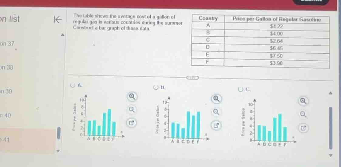
the table shows the average cost of a gallon of regular gas in various countries during the summer. construct a bar graph of these data.
\
$$\begin{tabular}{|c|c|}
\\hline
country & price per gallon of regular gasoline \\\\
\\hline
a & \\$4.22 \\\\
\\hline
b & \\$4.00 \\\\
\\hline
c & \\$2.64 \\\\
\\hline
d & \\$6.45 \\\\
\\hline
e & \\$7.50 \\\\
\\hline
f & \\$3.90 \\\\
\\hline
\\end{tabular}$$
⚡ Using what you learned: displaying data: bar graphs & circle graphs
Step 1: Analyze the data table
Identify the values for each country:
- A: \$4.22
- B: \$4.00
- C: \$2.64
- D: \$6.45
- E: \$7.50
- F: \$3.90
Step 2: Compare values with the graph options
Examine the heights of the bars for each country in the given options:
- Option A:
- Bar E is at \$7.50 (clearly higher than Bar D).
- Bar D is at approximately \$6.45.
- Bar F is just under \$4.00 (at \$3.90).
- Option B:
- Bar E and Bar F are shown with almost equal heights near \$7.50, which is incorrect because Country **F** is \$3.90.
- Option C:
- Bar D is shown as shorter than Bar C, which is incorrect because \$6.45 is greater than \$2.64.
Thus, Option A correctly represents all the data points.

Snap & solve any problem in the app
Get step-by-step solutions on Sovi AI
Photo-based solutions with guided steps
Explore more problems and detailed explanations
A