QUESTION IMAGE
Question
question 14 (multiple choice worth 1 points)
(categorizing and displaying data lc)
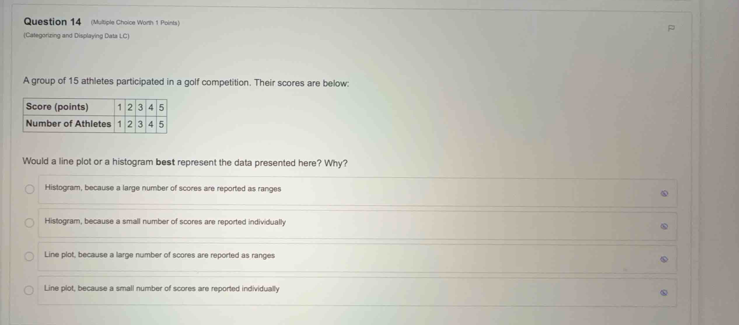
a group of 15 athletes participated in a golf competition. their scores are below:
would a line plot or a histogram best represent the data presented here? why?
- histogram, because a large number of scores are reported as ranges
- histogram, because a small number of scores are reported individually
- line plot, because a large number of scores are reported as ranges
- line plot, because a small number of scores are reported individually
Analyze the given data structure
The table shows individual, discrete scores from \(1\) to \(5\) and the frequency of each score. The total number of data points is small (\(15\) athletes), and each score is reported individually rather than grouped into intervals or ranges.
Compare line plots and histograms
A line plot (or dot plot) is ideal for displaying small datasets where individual values are recorded and can be plotted directly on a number line. A histogram is used for larger datasets where data is grouped into continuous intervals (ranges).
Evaluate the given options
Since we have a small dataset (\(15\) scores) and the scores are reported individually as discrete values (\(1, 2, 3, 4, 5\)), a line plot is the best representation. This matches the reasoning: "Line plot, because a small number of scores are reported individually."

Snap & solve any problem in the app
Get step-by-step solutions on Sovi AI
Photo-based solutions with guided steps
Explore more problems and detailed explanations
- Histogram, because a large number of scores are reported as ranges
- Histogram, because a small number of scores are reported individually
- Line plot, because a large number of scores are reported as ranges
- Line plot, because a small number of scores are reported individually (Correct answer)