QUESTION IMAGE
Question
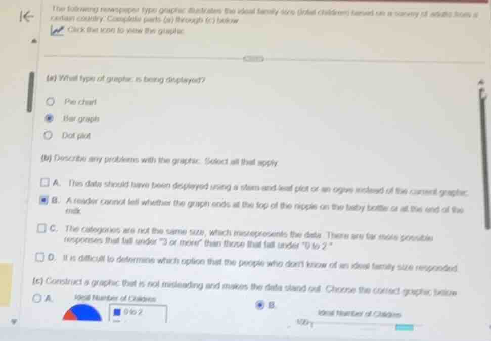
the following newspaper-type graphic illustrates the ideal family size (total children) based on a survey of adults from a certain country. complete parts (a) through (c) below.
(a) what type of graphic is being displayed?
- pie chart
- bar graph
- dot plot
(b) describe any problems with the graphic. select all that apply.
- a. this data should have been displayed using a stem-and-leaf plot or an ogive instead of the current graphic.
- b. a reader cannot tell whether the graph ends at the top of the nipple on the baby bottle or at the end of the milk.
- c. the categories are not the same size, which misrepresents the data. there are far more possible responses that fall under \3 or more\ than those that fall under \0 to 2\.
- d. it is difficult to determine which option that the people who dont know of an ideal family size responded.
(c) construct a graphic that is not misleading and makes the data stand out. choose the correct graphic below.
⚡ Using what you learned: Misleading Graphs & Data Interpretation
Step 1: Identify the Graphic Type
The question asks to identify the type of graphic displayed. Based on the selected option in the image, the graphic is a Bar graph (specifically, a pictogram-style bar graph using baby bottles to represent data heights).
Step 2: Identify Problems with the Graphic
We evaluate the potential issues with using a pictogram (like baby bottles) to represent data:
- Option B is selected: "A reader cannot tell whether the graph ends at the top of the nipple on the baby bottle or at the end of the milk." This is a classic issue with pictograms where the reference point for the measurement scale is ambiguous.
Step 3: Select the Correct Non-Misleading Graphic
To make the data stand out without being misleading, a standard, clear graphical representation should be used:
- Option B (a standard horizontal or vertical bar graph with a clear, well-defined scale starting at zero) is selected as the correct, non-misleading graphic.

Snap & solve any problem in the app
Get step-by-step solutions on Sovi AI
Photo-based solutions with guided steps
Explore more problems and detailed explanations
Part (a)
Bar graph
Part (b)
B. A reader cannot tell whether the graph ends at the top of the nipple on the baby bottle or at the end of the milk.
Part (c)
B