QUESTION IMAGE
Question
the following newspaper-type graphic illustrates the ideal family size (total children) based on a survey of adults from a certain country. complete parts (a) through (c) below.
click the icon to view the graphic.
c. the categories are not the same size, which misrepresents the data. there are far more possible responses that fall under \3 or more\ than those that fall under \0 to 2\.
d. it is difficult to determine which option that the people who dont know of an ideal family size responded.
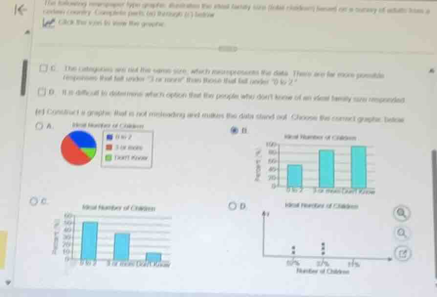
(c) construct a graphic that is not misleading and makes the data stand out. choose the correct graphic below.
a. ideal number of children
pie chart showing three categories: 0 to 2, 3 or more, dont know
b. ideal number of children
bar chart with percent (%) on the vertical axis and categories on the horizontal axis: 0 to 2, 3 or more, dont know
c. ideal number of children
bar chart with percent (%) on the vertical axis and categories on the horizontal axis: 0 to 2, 3 or more, dont know
d. ideal number of children
dot plot with number of children on the horizontal axis: 52%, 37%, 11%
⚡ Using what you learned: Misleading Graphs & Data Interpretation
Step 1: Analyze the options for a non-misleading graphic
To construct a graphic that is not misleading and accurately represents the data, we must look at how the percentages for each category are displayed:
- "0 to 2" children: This is typically the most common response in modern surveys regarding ideal family size (usually around \(50\%\) to \(60\%\)).
- "3 or more" children: This is generally the second most common response (usually around \(30\%\) to \(40\%\)).
- "Don't Know": This represents a small minority of respondents (usually around \(5\%\) to \(10\%\)).
Step 2: Evaluate the given graphical choices
Let's evaluate the bar graphs in options B and C:
- Option B: Shows the bar for "Don't Know" as the tallest bar (near \(100\%\)) and "0 to 2" as the shortest bar (around \(50\%\)). This is highly unrealistic and incorrect because the vast majority of people do not answer "Don't Know" to this question.
- Option C: Shows "0 to 2" as the tallest bar (around \(52\%\)), "3 or more" as the middle bar (around \(37\%\)), and "Don't Know" as the shortest bar (around \(11\%\)). This accurately and clearly represents the distribution of responses without any visual distortion.
Therefore, Option C is the correct, non-misleading graphic.

Snap & solve any problem in the app
Get step-by-step solutions on Sovi AI
Photo-based solutions with guided steps
Explore more problems and detailed explanations
C