QUESTION IMAGE
Question
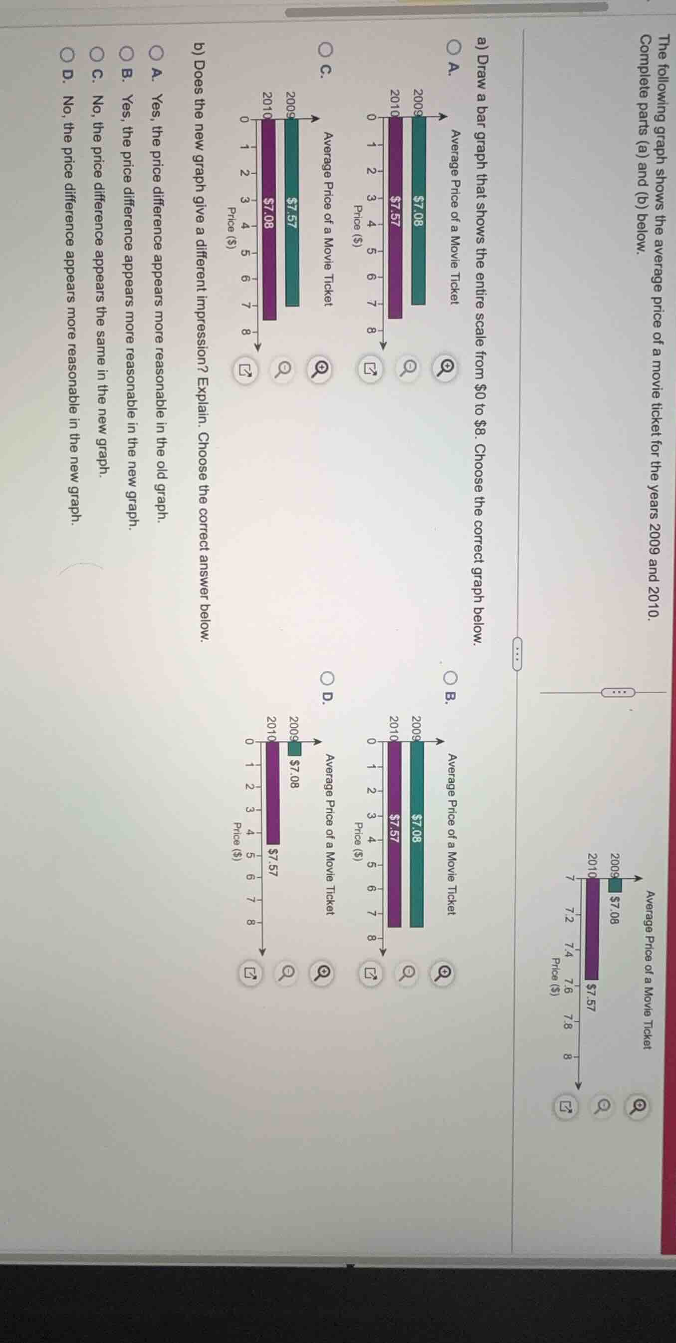
the following graph shows the average price of a movie ticket for the years 2009 and 2010. complete parts (a) and (b) below.
a) draw a bar graph that shows the entire scale from \\$0 to \\$8. choose the correct graph below.
a.
average price of a movie ticket
2009: \\$7.08
2010: \\$7.57
price (\\$): 0, 1, 2, 3, 4, 5, 6, 7, 8
b.
average price of a movie ticket
2009: \\$7.08
2010: \\$7.57
price (\\$): 0, 1, 2, 3, 4, 5, 6, 7, 8
c.
average price of a movie ticket
2009: \\$7.57
2010: \\$7.08
price (\\$): 0, 1, 2, 3, 4, 5, 6, 7, 8
d.
average price of a movie ticket
2009: \\$7.08
2010: \\$7.57
price (\\$): 0, 1, 2, 3, 4, 5, 6, 7, 8
b) does the new graph give a different impression? explain. choose the correct answer below.
a. yes, the price difference appears more reasonable in the old graph.
b. yes, the price difference appears more reasonable in the new graph.
c. no, the price difference appears the same in the new graph.
d. no, the price difference appears more reasonable in the new graph.
Identify the correct bar graph for part (a)
Using the Bar Graph Construction knowledge point
- The original graph shows:
- Year 2009: Average Price = \$7.08
- Year 2010: Average Price = \$7.57
- We need to find the graph that correctly plots these values on a scale from \$0 to \$8.
- Let's inspect the options:
- A: 2009 bar is at \$7.08, 2010 bar is at \$7.57.
- B: 2009 bar is at \$7.08, 2010 bar is at \$7.57. (Wait, let's look closer at the differences between A, B, C, and D).
- In A: 2009 (teal bar) is at \$7.08, 2010 (purple bar) is at \$7.57.
- In B: 2009 (teal bar) is at \$7.08, 2010 (purple bar) is at \$7.57. Let's compare the labels and heights.
- In C: 2009 (teal bar) is labeled \$7.57, 2010 (purple bar) is labeled \$7.08. This is reversed.
- In D: 2009 (teal bar) is labeled \$7.08, 2010 (purple bar) is labeled \$7.57, but the purple bar is shorter than the teal bar, which is incorrect since \$7.57 > \$7.08.
- Let's re-examine A vs B:
- In A: The teal bar (2009) is labeled \$7.08, and the purple bar (2010) is labeled \$7.57. The purple bar is longer than the teal bar.
- In B: The teal bar (2009) is labeled \$7.08, and the purple bar (2010) is labeled \$7.57. The purple bar is longer than the teal bar. Let's look at the alignment with the grid lines.
- In A: The teal bar (2009) ends just past 7 (at 7.08), and the purple bar (2010) ends around 7.6 (at 7.57).
- In B: The teal bar (2009) ends around 7.6, and the purple bar (2010) ends around 7.1. The lengths are mismatched with the labels.
- Therefore, A is the correct graph.
Analyze the impression of the new graph for part (b)
Using the Scale Distortion knowledge point
- The original graph has a truncated scale starting at \$7, which exaggerates the difference between \$7.08 and \$7.57, making the increase look massive.
- The new graph starts at \$0, showing the entire scale. On this scale, the difference between \$7.08 and \$7.57 is visually very small and represents the actual proportional change.
- Thus, the price difference appears more reasonable (or less exaggerated) in the new graph.
- Let's look at the options for part (b):
- A: Yes, the price difference appears more reasonable in the old graph.
- B: Yes, the price difference appears more reasonable in the new graph.
- C: No, the price difference appears the same in the new graph.
- D: No, the price difference appears more reasonable in the new graph. (This is a contradiction in its "No" statement).
- Therefore, B is the correct choice.

Snap & solve any problem in the app
Get step-by-step solutions on Sovi AI
Photo-based solutions with guided steps
Explore more problems and detailed explanations
Question 1
- (A) (Correct answer)
- (B)
- (C)
- (D)
Question 2
- (A) Yes, the price difference appears more reasonable in the old graph.
- (B) Yes, the price difference appears more reasonable in the new graph. (Correct answer)
- (C) No, the price difference appears the same in the new graph.
- (D) No, the price difference appears more reasonable in the new graph.