QUESTION IMAGE
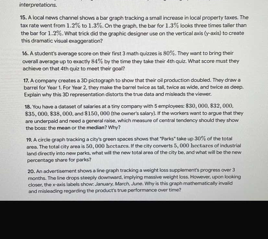
Question
- a local news channel shows a bar graph tracking a small increase in local property taxes. the tax rate went from 1.2% to 1.3%. on the graph, the bar for 1.3% looks three times taller than the bar for 1.2%. what trick did the graphic designer use on the vertical axis (y-axis) to create this dramatic visual exaggeration?
- a students average score on their first 3 math quizzes is 80%. they want to bring their overall average up to exactly 84% by the time they take their 4th quiz. what score must they achieve on that 4th quiz to meet their goal?
- a company creates a 3d pictograph to show that their oil production doubled. they draw a barrel for year 1. for year 2, they make the barrel twice as tall, twice as wide, and twice as deep. explain why this 3d representation distorts the true data and misleads the viewer.
- you have a dataset of salaries at a tiny company with 5 employees: \\$30,000, \\$32,000, \\$35,000, \\$38,000, and \\$150,000 (the owners salary). if the workers want to argue that they are underpaid and need a general raise, which measure of central tendency should they show the boss: the mean or the median? why?
- a circle graph tracking a citys green spaces shows that \parks\ take up 30% of the total area. the total city area is 50,000 hectares. if the city converts 5,000 hectares of industrial land directly into new parks, what will the new total area of the city be, and what will be the new percentage share for parks?
- an advertisement shows a line graph tracking a weight loss supplements progress over 3 months. the line drops steeply downward, implying massive weight loss. however, upon looking closer, the x-axis labels show: january, march, june. why is this graph mathematically invalid and misleading regarding the products true performance over time?
Question 15: Identify the y-axis manipulation trick
Question 16: Calculate the required score on the 4th quiz
Question 17: Explain the 3D volume scaling distortion
Question 18: Select the best measure of central tendency for the argument
Question 19: Calculate the new total area and percentage share
Question 20: Identify the x-axis interval inconsistency

Snap & solve any problem in the app
Get step-by-step solutions on Sovi AI
Photo-based solutions with guided steps
Explore more problems and detailed explanations
Question 15
The designer used a truncated vertical axis (a \(y\)-axis that does not start at zero), which exaggerates the visual difference between the two values.
Question 16
\(96\%\)
Question 17
Doubling all three dimensions (height, width, and depth) increases the volume of the 3D barrel by a factor of \(8\) (\(2 \times 2 \times 2 = 8\)), which visually overstates a twofold increase in production.
Question 18
The median. The median (\(\$35,000\)) is much lower than the mean (\(\$57,000\)) because the mean is skewed upward by the owner's outlier salary of \(\$150,000\). Showing the lower median better supports their argument that they are underpaid.
Question 19
New total area: \(50,000\) hectares; New percentage share: \(40\%\)
Question 20
The time intervals on the \(x\)-axis are inconsistent (January to March is 2 months, while March to June is 3 months). Plotting these unequal time periods with equal spacing on the axis distorts the rate of weight loss over time.