QUESTION IMAGE
Question
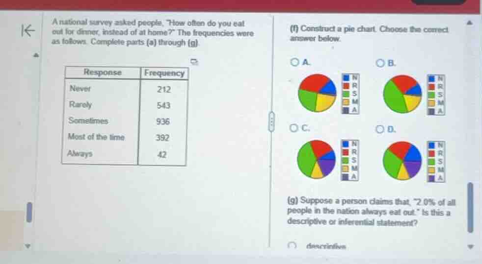
a national survey asked people, \how often do you eat out for dinner, instead of at home?\ the frequencies were as follows. complete parts (a) through (g).
\
(f) construct a pie chart. choose the correct answer below.
(g) suppose a person claims that, \2.0\\% of all people in the nation always eat out.\ is this a descriptive or inferential statement?
⚡ Using what you learned: displaying data: bar graphs & circle graphs · 🆕 New Concept: Descriptive vs. Inferential Statistics
Generalizing sample data to a larger population
Step 1: Calculate the total frequency and relative percentages
To determine the correct pie chart, we first find the total number of survey respondents:
Next, we calculate the relative percentage for each response category:
- Never (N - Blue):
- Rarely (R - Red):
- Sometimes (S - Green):
- Most of the time (M - Yellow):
- Always (A - Purple):
Step 2: Identify the correct pie chart
We look for the pie chart that matches these proportions:
- Sometimes (Green): Almost half of the circle (\(44\%\)).
- Rarely (Red): Just over a quarter of the circle (\(25.6\%\)).
- Most of the time (Yellow): About \(18.4\%\).
- Never (Blue): Exactly \(10\%\).
- Always (Purple): A very small sliver (\(2\%\)).
Comparing the options:
- In A and B, the "Always" (Purple) slice is missing or colored incorrectly (yellow is used instead of purple for the smallest slice).
- In C and D, the purple slice represents "Always" (\(2\%\)) and the yellow slice represents "Most of the time" (\(18.4\%\)).
- Comparing C and D, we look at the blue slice ("Never" = \(10\%\)) and the purple slice ("Always" = \(2\%\)). In C, the blue slice is noticeably larger than the purple slice, representing the \(10\%\) to \(2\%\) ratio correctly. In D, the blue and purple slices are nearly identical in size, which is incorrect.
Thus, C is the correct pie chart.
Step 3: Determine if the statement in (g) is descriptive or inferential
The statement is: "2.0% of all people in the nation always eat out."
- Descriptive statistics only describe the actual data collected from the sample (e.g., "2.0% of the surveyed people always eat out").
- Inferential statistics take a result from a sample and extend/generalize it to make a claim about the entire population ("all people in the nation").
Because this statement makes a claim about the entire national population based on a sample survey, it is an inferential statement.

Snap & solve any problem in the app
Get step-by-step solutions on Sovi AI
Photo-based solutions with guided steps
Explore more problems and detailed explanations
(f) C
(g) inferential