QUESTION IMAGE
Question
a misleading graph is a statistical graph that is not drawn appropriately. this type of graph can misrepresent data and lead to false conclusions.
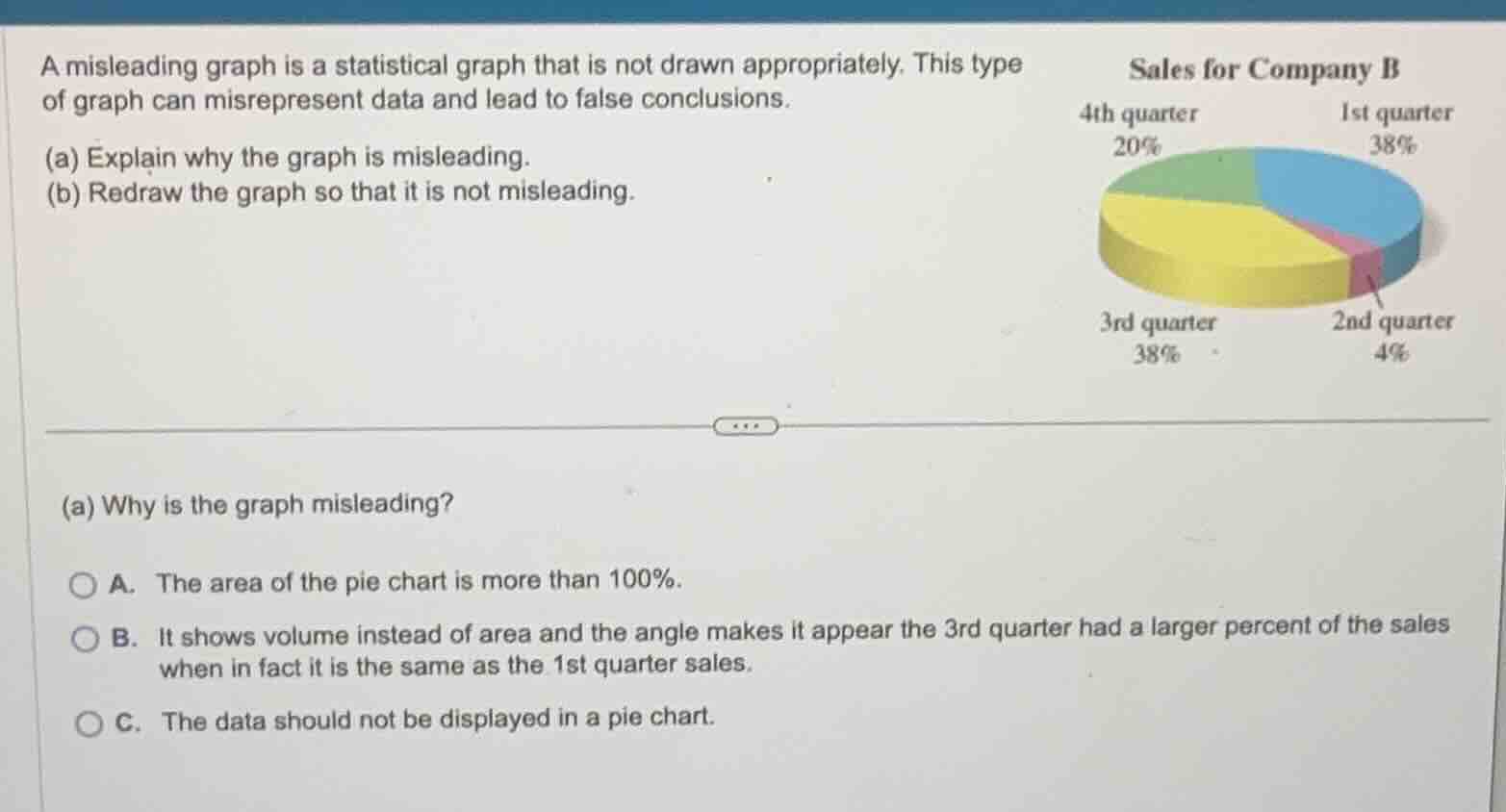
(a) explain why the graph is misleading.
(b) redraw the graph so that it is not misleading.
sales for company b
4th quarter 20%
1st quarter 38%
3rd quarter 38%
2nd quarter 4%
(a) why is the graph misleading?
a. the area of the pie chart is more than 100%.
b. it shows volume instead of area and the angle makes it appear the 3rd quarter had a larger percent of the sales when in fact it is the same as the 1st quarter sales.
c. the data should not be displayed in a pie chart.
Analyze the pie chart properties
Evaluate the 3D perspective effect
The 3D perspective tilt adds depth (volume) to the pie chart. This distortion makes the 3rd quarter slice (at the front) appear visually much larger than the 1st quarter slice (at the back), even though both represent exactly \(38\%\) of the sales.
Match with the multiple-choice options
Option B correctly identifies that the 3D effect shows volume instead of area, and the perspective angle distorts the visual comparison between the 3rd quarter and 1st quarter sales.

Snap & solve any problem in the app
Get step-by-step solutions on Sovi AI
Photo-based solutions with guided steps
Explore more problems and detailed explanations
- A. The area of the pie chart is more than 100%.
- B. It shows volume instead of area and the angle makes it appear the 3rd quarter had a larger percent of the sales when in fact it is the same as the 1st quarter sales. (Correct answer)
- C. The data should not be displayed in a pie chart.