QUESTION IMAGE
Question
a.
b.
c.
d.
Analyze the scatter plot data trend
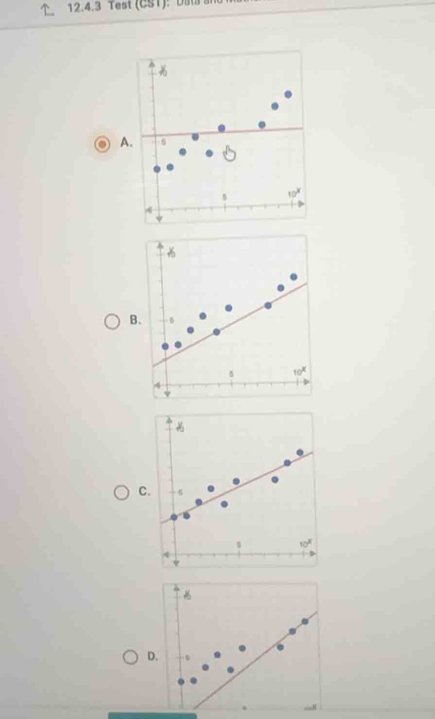
The scatter plot shows a set of data points that trend upward from left to right, indicating a positive linear correlation.
Evaluate the line of best fit in each option
- Option A: The line is horizontal, which does not represent the positive upward trend of the data.
- Option B: The line is below almost all of the data points, failing to pass through the center of the data distribution.
- Option C: The line passes directly through the middle of the data points, balancing the points above and below the line, which correctly represents the trend.
- Option D: The line is too steep and lies below most of the points on the left side.

Snap & solve any problem in the app
Get step-by-step solutions on Sovi AI
Photo-based solutions with guided steps
Explore more problems and detailed explanations
- (A) Horizontal line
- (B) Line below the data points
- (C) Line passing through the middle of the data points (Correct answer)
- (D) Line too steep and below the left data points