QUESTION IMAGE
Question
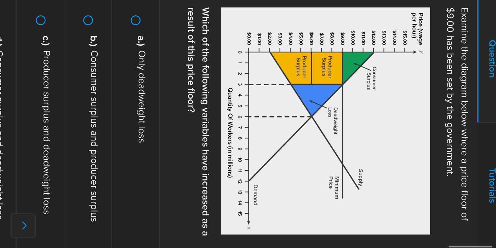
examine the diagram below where a price floor of \\$9.00 has been set by the government.
which of the following variables have increased as a result of this price floor?
a.) only deadweight loss
b.) consumer surplus and producer surplus
c.) producer surplus and deadweight loss
🆕 New Concept Discovered: Price Floor Welfare Analysis
How government-mandated minimum prices alter consumer, producer, and total economic surplus.
Step 1: Identify the initial equilibrium state
Before the price floor is implemented, the market is in equilibrium where the demand curve and supply curve intersect:
- Equilibrium Price (Wage): \( \$6.00 \)
- Equilibrium Quantity: \( 6 \) million workers
At this equilibrium:
- Consumer Surplus (CS): The area below the demand curve and above the equilibrium price of \( \$6.00 \).
- Producer Surplus (PS): The area above the supply curve and below the equilibrium price of \( \$6.00 \).
- Deadweight Loss (DWL): There is no deadweight loss in a perfectly competitive equilibrium (\( \text{DWL} = 0 \)).
Step 2: Analyze the market after the price floor is set
A minimum price (price floor) is set at \( \$9.00 \).
- Quantity Demanded: At a wage of \( \$9.00 \), employers are only willing to hire \( 3 \) million workers (found on the demand curve).
- Quantity Supplied: At a wage of \( \$9.00 \), \( 9 \) million workers want to work (found on the supply curve).
- Actual Quantity Traded: Because transactions require both a willing buyer and a willing seller, the actual quantity of workers employed drops to the lower of the two, which is \( 3 \) million.
Step 3: Determine the changes in surplus and deadweight loss
Let's compare the welfare regions before and after the price floor:
- Consumer Surplus:
- Before: The large triangular area above \( \$6.00 \) and below the demand curve.
- After: The small green triangle above \( \$9.00 \) and below the demand curve.
- Result: Consumer surplus has decreased.
- Deadweight Loss:
- Before: \( 0 \)
- After: The blue triangular area representing lost mutually beneficial transactions between \( 3 \) million and \( 6 \) million workers.
- Result: Deadweight loss has increased (from zero to a positive value).
- Producer Surplus:
- Before: The triangular area below \( \$6.00 \) and above the supply curve up to \( 6 \) million units.
- After: The yellow-shaded region. This consists of the rectangle between \( \$3.00 \) and \( \$9.00 \) for the \( 3 \) million employed workers, minus their opportunity cost (the area under the supply curve up to \( 3 \) million).
- Looking at the visual representation, the new producer surplus (the yellow area) is significantly larger than the original triangular producer surplus below the \( \$6.00 \) line.
- Result: Producer surplus has increased.
Therefore, the variables that have increased as a result of this price floor are producer surplus and deadweight loss.

Snap & solve any problem in the app
Get step-by-step solutions on Sovi AI
Photo-based solutions with guided steps
Explore more problems and detailed explanations
c.) Producer surplus and deadweight loss