QUESTION IMAGE
Question
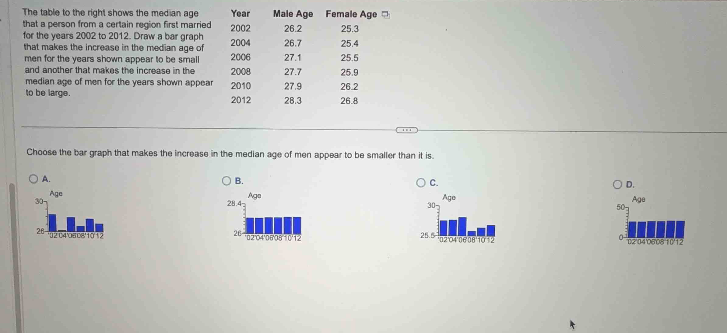
the table to the right shows the median age that a person from a certain region first married for the years 2002 to 2012. draw a bar graph that makes the increase in the median age of men for the years shown appear to be small and another that makes the increase in the median age of men for the years shown appear to be large.
choose the bar graph that makes the increase in the median age of men appear to be smaller than it is.
Analyze the data and scale distortion
Using the Scale Distortion and Statistical Misinterpretation knowledge points
- The male median age increases from \(26.2\) in 2002 to \(28.3\) in 2012.
- To make this increase of \(2.1\) years appear smaller than it is, the vertical axis scale should be stretched vertically by starting at \(0\) and going up to a large value (like \(50\)).
- In Graph D, the vertical axis ranges from \(0\) to \(50\). The bars all look nearly identical in height, making the increase from \(26.2\) to \(28.3\) look extremely small (almost flat).
Evaluate the options
Using the Scale Distortion knowledge point
- Graph A: Vertical axis is \(26\) to \(30\). The bars do not match the increasing trend correctly (some bars drop).
- Graph B: Vertical axis is \(26\) to \(28.4\). This narrow range exaggerates the differences, making the increase look large.
- Graph C: Vertical axis is \(25.5\) to \(30\). The bars do not show a steady increase.
- Graph D: Vertical axis is \(0\) to \(50\). The bars show a steady, very slight increase, which visually minimizes the actual change.

Snap & solve any problem in the app
Get step-by-step solutions on Sovi AI
Photo-based solutions with guided steps
Explore more problems and detailed explanations
- (A) Graph with y-axis from 26 to 30 showing non-monotonic bars
- (B) Graph with y-axis from 26 to 28.4 showing a large apparent increase
- (C) Graph with y-axis from 25.5 to 30 showing non-monotonic bars
- (D) Graph with y-axis from 0 to 50 making the increase appear very small (Correct answer)