QUESTION IMAGE
Question
Question was provided via image upload.
Identify the chart type and structure
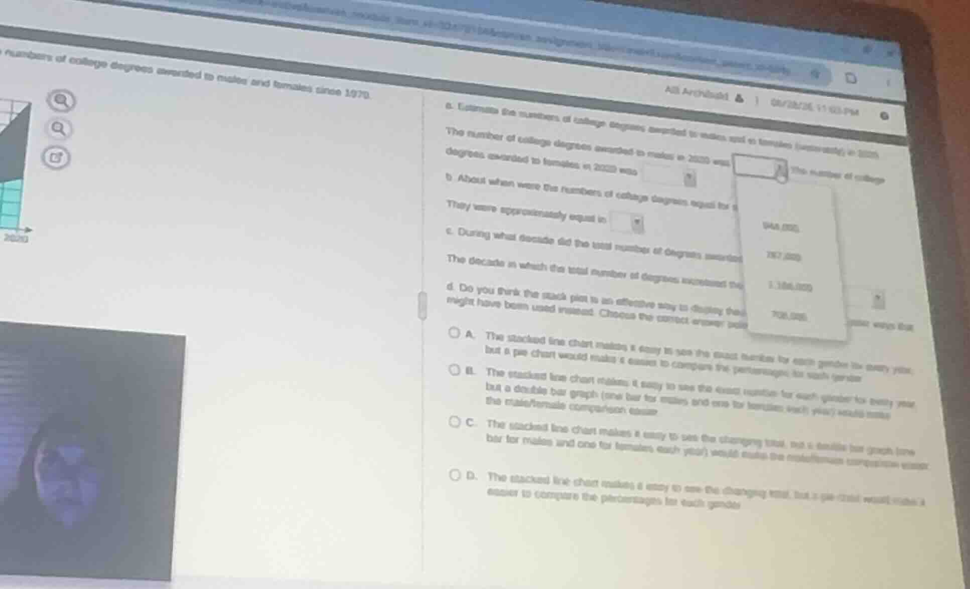
Using the Stacked Line Chart Interpretation knowledge point, we analyze the visual representation. The problem describes a stacked plot showing the numbers of college degrees awarded to males and females since 1970. In a stacked line chart, the bottom region represents the first category (males), and the top region is stacked on top of it, meaning the upper boundary line represents the combined total of both categories.
Analyze the specific question part
We focus on part (d) of the question, which is fully visible: "Do you think the stack plot is an effective way to display these data? Identify other ways that might have been used instead. Choose the correct answer below."
Evaluate the options
Using the Data Visualization Evaluation knowledge point, we evaluate the effectiveness of a stacked line chart:
- A stacked line chart is highly effective for showing how the total of the categories changes over time because the top line represents the sum.
- However, because the top category (females) is stacked on top of the bottom category (males), its baseline is not flat. This makes it difficult to visually compare the exact values or trends of the individual categories directly.
- A double bar graph (with side-by-side bars for males and females each year) would provide a flat baseline for both groups, making direct comparison between male and female degree counts much easier.
Let's match this analysis to the given options:
- A: Incorrectly states that the stacked line chart makes it easy to see the exact numbers for each gender.
- B: Incorrectly states that the stacked line chart makes it easy to see the exact numbers for each gender.
- C: Correctly states: "The stacked line chart makes it easy to see the changing total, but a double bar graph (one bar for males and one for females each year) would make the male/female comparison easier."
- D: Suggests a pie chart, which is not suitable for showing trends over a continuous timeline since 1970.
Select the correct option
The correct option is C.

Snap & solve any problem in the app
Get step-by-step solutions on Sovi AI
Photo-based solutions with guided steps
Explore more problems and detailed explanations
Question 4
- (A) The stacked line chart makes it easy to see the exact numbers for each gender for every year, but a pie chart would make it easier to compare the percentages for each gender.
- (B) The stacked line chart makes it easy to see the exact numbers for each gender for every year, but a double bar graph (one bar for males and one for females each year) would make the male/female comparison easier.
- (C) The stacked line chart makes it easy to see the changing total, but a double bar graph (one bar for males and one for females each year) would make the male/female comparison easier. (Correct answer)
- (D) The stacked line chart makes it easy to see the changing total, but a pie chart would make it easier to compare the percentages for each gender.