QUESTION IMAGE
Question
Question was provided via image upload.
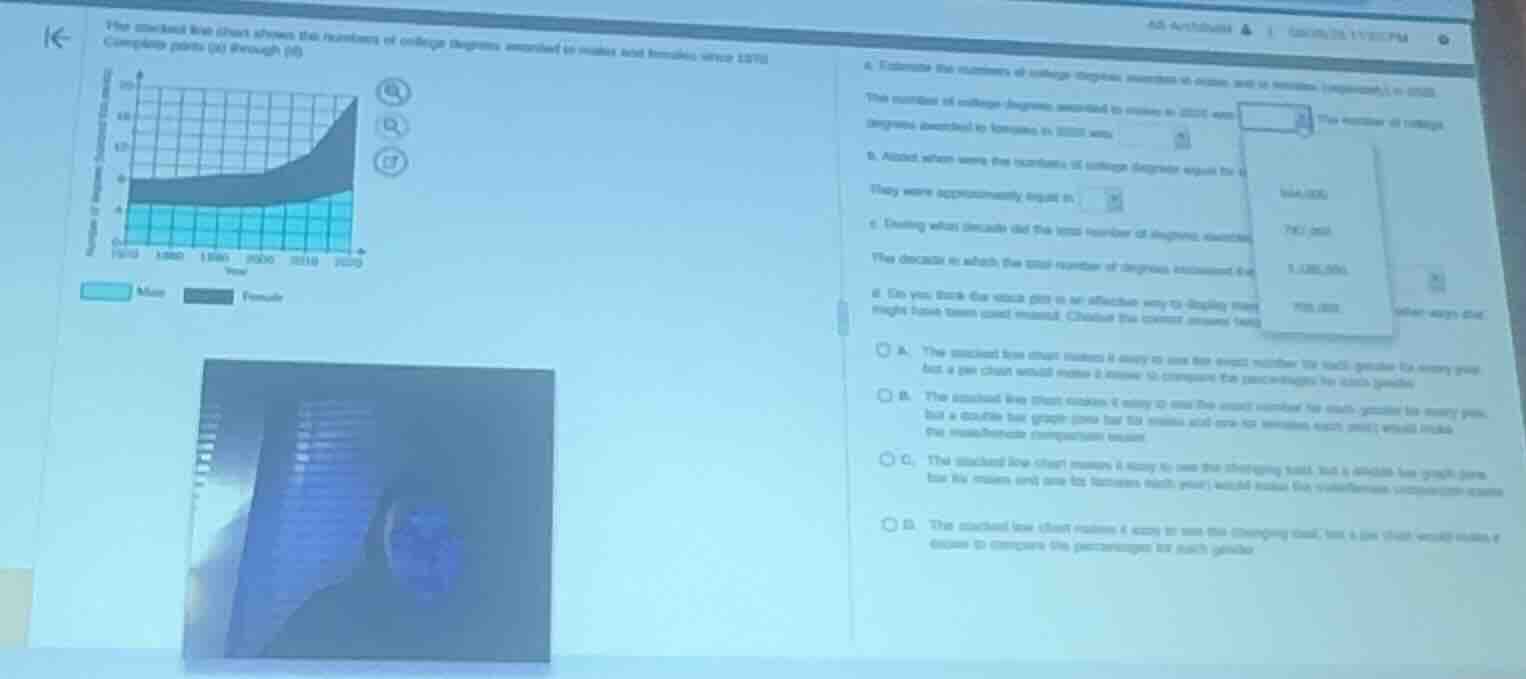
Read values for 2020
Using the Stacked Line Chart Interpretation knowledge point
- The bottom region represents "Male" (light blue) and the top region represents "Female" (dark grey).
- In the year 2020, the boundary line between the Male and Female regions is at \(1.0\) million (which is \(1,000,000\)). This represents the number of degrees awarded to males.
- The top boundary of the stacked chart in 2020 is at \(2.1\) million (which is \(2,100,000\)).
- The number of degrees awarded to females is the difference:
Determine when values were equal
Using the Stacked Line Chart Interpretation knowledge point
- The two groups are equal when the height of the Male region equals the height of the Female region.
- This means the boundary line between them must be exactly halfway to the top line of the chart (i.e., the Male region is half of the total height).
- Looking at the chart, from 1970 to around 1980, the Male region is thicker than the Female region.
- Around 1980, the boundary line is at approximately \(0.5\) million, and the total height is approximately \(1.0\) million. Thus, both males and females received about \(500,000\) degrees.
- Therefore, the numbers were approximately equal in 1980.
Identify the decade of greatest increase
Using the Stacked Line Chart Interpretation knowledge point
- We look for the decade where the total height (the top line of the stacked chart) has the steepest upward slope.
- From 1970 to 2000, the top line is relatively flat or rising very gradually.
- From 2000 to 2010, the top line rises more noticeably.
- From 2010 to 2020, the top line rises very sharply (from around \(1.4\) million to \(2.1\) million, an increase of about \(700,000\)).
- Therefore, the total number of degrees increased the most during the decade 2010–2020.
Evaluate the visualization effectiveness
Using the Data Visualization Evaluation knowledge point
- Stacked line charts are excellent for showing the changing total sum over time.
- However, because the female layer is stacked on top of the male layer, it does not start from a flat baseline, making it difficult to compare the exact values or trends of the two genders directly.
- A double bar graph (with side-by-side bars for males and females each year) would make direct comparison between the two genders much easier.
- This matches option C: "The stacked line chart makes it easy to see the changing total, but a double bar graph (one bar for males and one for females each year) would make the male/female comparison easier."

Snap & solve any problem in the app
Get step-by-step solutions on Sovi AI
Photo-based solutions with guided steps
Explore more problems and detailed explanations
Question 1
The number of college degrees awarded to males in 2020 was <blank>\(1,000,000\)</blank>.
The number of college degrees awarded to females in 2020 was <blank>\(1,100,000\)</blank>.
Question 2
They were approximately equal in <blank>1980</blank>.
Question 3
The decade in which the total number of degrees increased the most was <blank>2010–2020</blank>.
Question 4
- A. The stacked line chart makes it easy to see the exact number for each gender for every year, but a pie chart would make it easier to compare the percentages for each gender.
- B. The stacked line chart makes it easy to see the exact number for each gender for every year, but a double bar graph (one bar for males and one for females each year) would make the male/female comparison easier.
- C. The stacked line chart makes it easy to see the changing total, but a double bar graph (one bar for males and one for females each year) would make the male/female comparison easier. (Correct answer)
- D. The stacked line chart makes it easy to see the changing total, but a pie chart that would make it easier to compare the percentages for each gender.