QUESTION IMAGE
Question
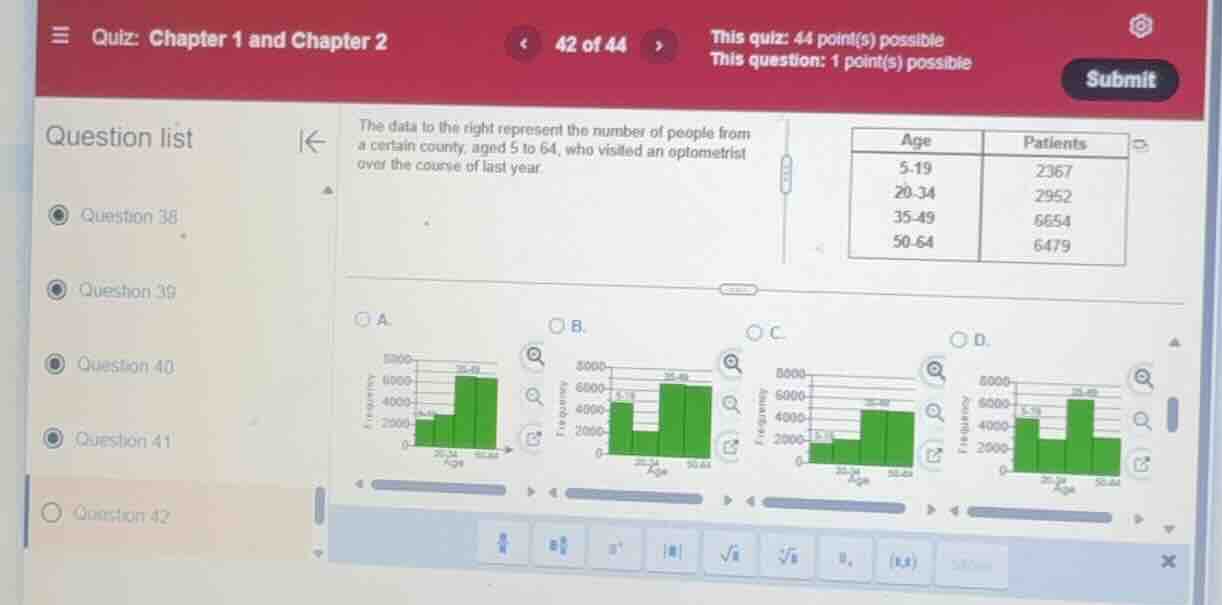
the data to the right represent the number of people from a certain county, aged 5 to 64, who visited an optometrist over the course of last year.
\
$$\begin{tabular}{|c|c|}
\\hline
age & patients \\\\
\\hline
5-19 & 2367 \\\\
20-34 & 2952 \\\\
35-49 & 6654 \\\\
50-64 & 6479 \\\\
\\hline
\\end{tabular}$$
choose the correct histogram representing the data.
a.
b.
c.
d.
⚡ Using what you learned: Organizing Data in Tables · 🆕 New: Histograms
Visualizing grouped frequency data using adjacent bars
Step 1: Analyze the Frequency Table
We are given a frequency table showing the number of patients in different age groups:
| Age Group | Patients (Frequency) |
|---|---|
| 20–34 | 2952 |
| 35–49 | 6654 |
| 50–64 | 6479 |
Step 2: Match the Data to the Graph Options
Let's look at the height of the bars for each age group in the options:
- First class (5–19): The frequency is \( 2367 \). The bar should be slightly above \( 2000 \).
- Second class (20–34): The frequency is \( 2952 \). The bar should be just below \( 3000 \).
- Comparing the first two classes: The second bar (\( 2952 \)) must be taller than the first bar (\( 2367 \)).
- Third class (35–49): The frequency is \( 6654 \). This is the tallest bar, reaching well above \( 6000 \).
- Fourth class (50–64): The frequency is \( 6479 \). This bar is slightly shorter than the third bar but still well above \( 6000 \).
Step 3: Evaluate the Choices
- Graph A:
- First bar (5–19) is around \( 2300 \).
- Second bar (20–34) is around \( 2900 \) (taller than the first).
- Third bar (35–49) is the tallest, over \( 6000 \).
- Fourth bar (50–64) is slightly shorter than the third, also over \( 6000 \).
- This matches our data perfectly.
- Graph B:
- The first bar is much taller than the second bar, which is incorrect because \( 2367 < 2952 \).
- Graph C:
- The third and fourth bars are below \( 5000 \), which is incorrect because both values (\( 6654 \) and \( 6479 \)) are well above \( 6000 \).
- Graph D:
- The first bar is taller than the second bar, and the fourth bar is much too short (around \( 3000 \)).
Therefore, Graph A is the correct representation.

Snap & solve any problem in the app
Get step-by-step solutions on Sovi AI
Photo-based solutions with guided steps
Explore more problems and detailed explanations
A