QUESTION IMAGE
Question
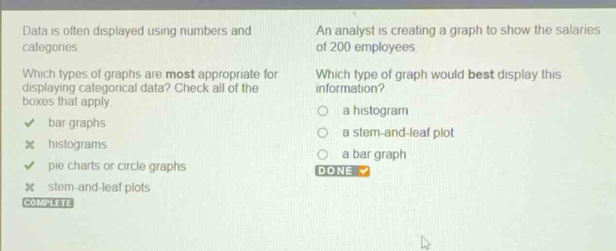
data is often displayed using numbers and categories
which types of graphs are most appropriate for displaying categorical data? check all of the boxes that apply.
bar graphs
histograms
pie charts or circle graphs
stem-and-leaf plots
an analyst is creating a graph to show the salaries of 200 employees.
which type of graph would best display this information?
( ) a histogram
( ) a stem-and-leaf plot
( ) a bar graph
Analyze the data type
Using the Categorical Data Representation and Types of Graphs knowledge points
The analyst wants to display the salaries of 200 employees. Salary is a continuous numerical variable.
Evaluate the graph options
Using the Types of Graphs knowledge point
- Histogram: Designed specifically for continuous numerical data grouped into intervals (bins). It is ideal for showing the distribution of a large dataset like 200 salaries.
- Stem-and-leaf plot: Best for small numerical datasets because listing individual digits becomes cluttered and impractical for 200 data points.
- Bar graph: Used for categorical data, not continuous numerical data.
Determine the best choice
Using the Types of Graphs knowledge point
A histogram is the most appropriate graph to display the distribution of 200 employee salaries.

Snap & solve any problem in the app
Get step-by-step solutions on Sovi AI
Photo-based solutions with guided steps
Explore more problems and detailed explanations
- a histogram (Correct answer)
- a stem-and-leaf plot
- a bar graph