QUESTION IMAGE
Question
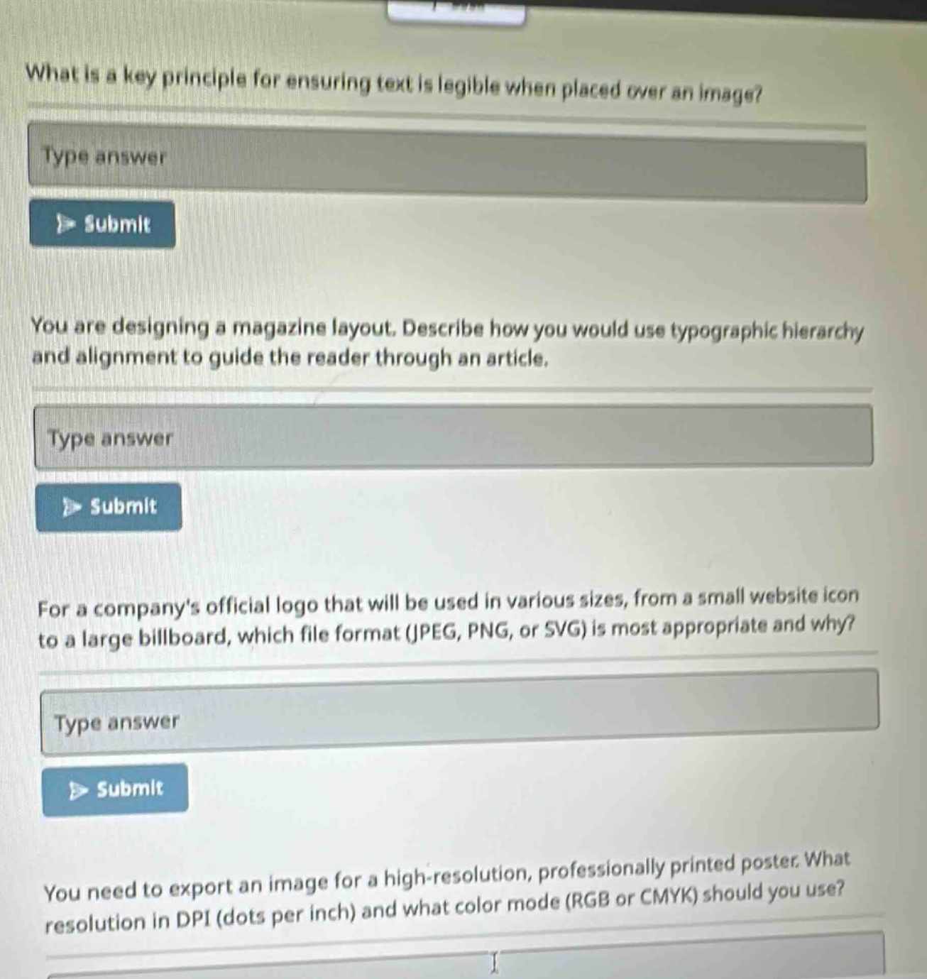
what is a key principle for ensuring text is legible when placed over an image?
you are designing a magazine layout. describe how you would use typographic hierarchy and alignment to guide the reader through an article.
for a companys official logo that will be used in various sizes, from a small website icon to a large billboard, which file format (jpeg, png, or svg) is most appropriate and why?
you need to export an image for a high-resolution, professionally printed poster. what resolution in dpi (dots per inch) and what color mode (rgb or cmyk) should you use?
🆕 New Concept Discovered: Graphic Design Principles
Fundamental rules for visual communication, layout, and print.
Step 1: Text Legibility Over Images
To ensure text is readable when placed directly over an image, the most critical factor is contrast.
- The Principle: There must be a high level of value contrast between the text color and the background image.
- How to achieve it:
- Use light text on dark areas of an image, or dark text on light areas.
- Place a semi-transparent solid color overlay (scrim) between the image and the text.
- Add a subtle drop shadow or text outline to separate the letterforms from a busy background.
Step 2: Typographic Hierarchy and Alignment in Magazine Layouts
To guide a reader smoothly through a magazine article, you establish a clear visual path using structure and order:
- Typographic Hierarchy (Visual Order):
- Level 1 (Headline): Use a large, bold, and distinctive typeface to immediately grab attention and signal the topic.
- Level 2 (Subheads & Lead-in): Use medium-sized, semi-bold text to bridge the headline and body text, breaking the article into digestible sections.
- Level 3 (Body Copy): Use a highly readable, smaller font size (typically 9–11pt) with comfortable line spacing (leading) for the main story.
- Alignment (Structure & Flow):
- Use a consistent grid system (such as left-aligned or justified text with clear margins) to create clean vertical lines. This gives the reader's eye a predictable starting and stopping point, reducing visual fatigue.
Step 3: Logo File Format Selection
For a logo that needs to scale from a tiny website favicon to a massive billboard, the correct format is SVG (Scalable Vector Graphics).
- Why: SVG is a vector format. Unlike raster formats (JPEG and PNG) which are made of a fixed grid of pixels and become blurry or pixelated when enlarged, vector graphics are made of mathematical paths, lines, and curves. This allows the logo to scale infinitely to any size while remaining perfectly sharp and crisp, all while maintaining a very small file size.
Step 4: Print Resolution and Color Mode
For a high-resolution, professionally printed poster, you must use the standard settings optimized for physical ink on paper:
- Resolution: 300 DPI (dots per inch) is the industry standard to ensure the print looks sharp and detailed up close.
- Color Mode: CMYK (Cyan, Magenta, Yellow, Key/Black). This is the color model used by professional printing presses, whereas RGB is meant exclusively for digital screens.

Snap & solve any problem in the app
Get step-by-step solutions on Sovi AI
Photo-based solutions with guided steps
Explore more problems and detailed explanations
1. Text Legibility Over Images
- Key Principle: High contrast between the text and the background.
- Methods: Use a semi-transparent dark/light overlay behind the text, add a subtle drop shadow, or place light text over dark parts of the image.
2. Magazine Layout (Hierarchy & Alignment)
- Hierarchy: Use a large, bold font for headlines (first priority), medium-sized subheadings to break up sections (second priority), and a highly readable, smaller font for the body text.
- Alignment: Use a consistent grid (such as left-aligned text) to create clean visual lines that guide the reader's eye naturally from one paragraph to the next.
3. Logo File Format
- Format: SVG
- Why: It is a vector format based on mathematical equations rather than pixels. This allows the logo to scale infinitely from a tiny icon to a giant billboard without losing quality or becoming pixelated.
4. Print Resolution and Color Mode
- Resolution: 300 DPI
- Color Mode: CMYK