QUESTION IMAGE
Question
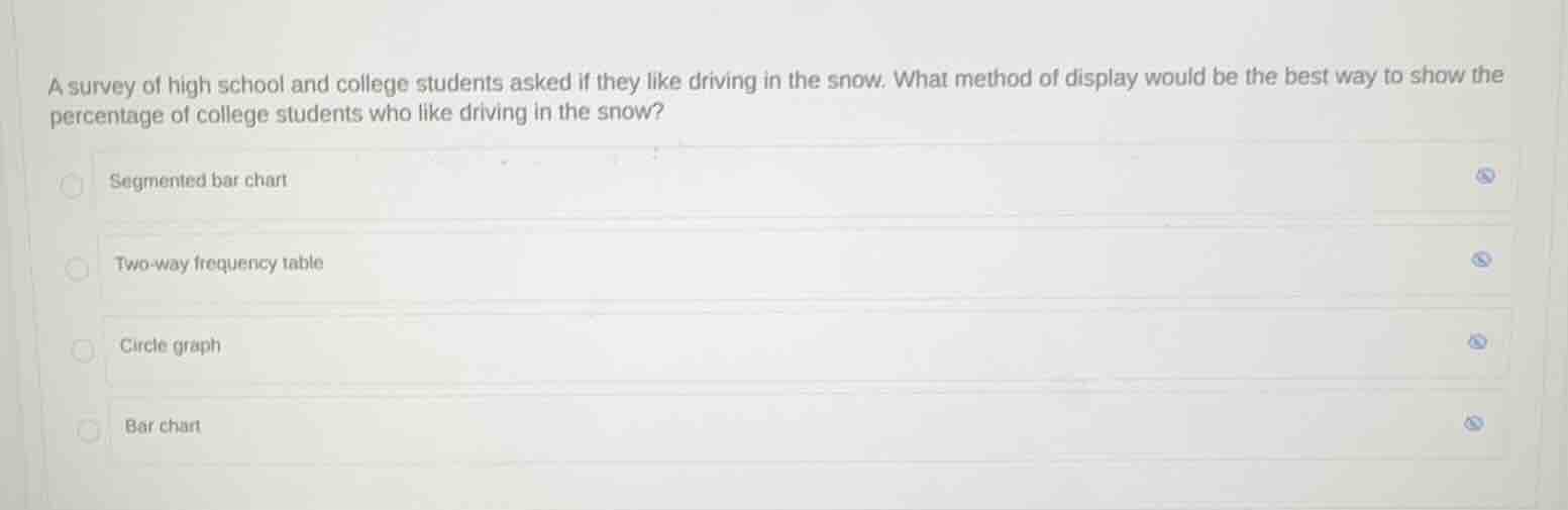
a survey of high school and college students asked if they like driving in the snow. what method of display would be the best way to show the percentage of college students who like driving in the snow?
segmented bar chart
two-way frequency table
circle graph
bar chart
Identify the target variable and representation goal
The question asks for the best display method to show a single specific percentage: "the percentage of college students who like driving in the snow."
Evaluate the options based on the goal
- Segmented bar chart: Used to compare relative frequencies of categorical variables across different groups.
- Two-way frequency table: Displays counts for two categorical variables, rather than highlighting a single percentage.
- Circle graph: Excellent for showing parts of a whole (percentages) for a specific group.
- Bar chart: Typically displays counts or values for different categories rather than a single part-to-whole percentage.
Select the best display method
A circle graph (pie chart) is specifically designed to show percentages of a whole for a single category or group, making it the best choice to represent a specific percentage of college students.

Snap & solve any problem in the app
Get step-by-step solutions on Sovi AI
Photo-based solutions with guided steps
Explore more problems and detailed explanations
- Segmented bar chart
- Two-way frequency table
- Circle graph (Correct answer)
- Bar chart