QUESTION IMAGE
Question
Question was provided via image upload.
Analyze the given graph
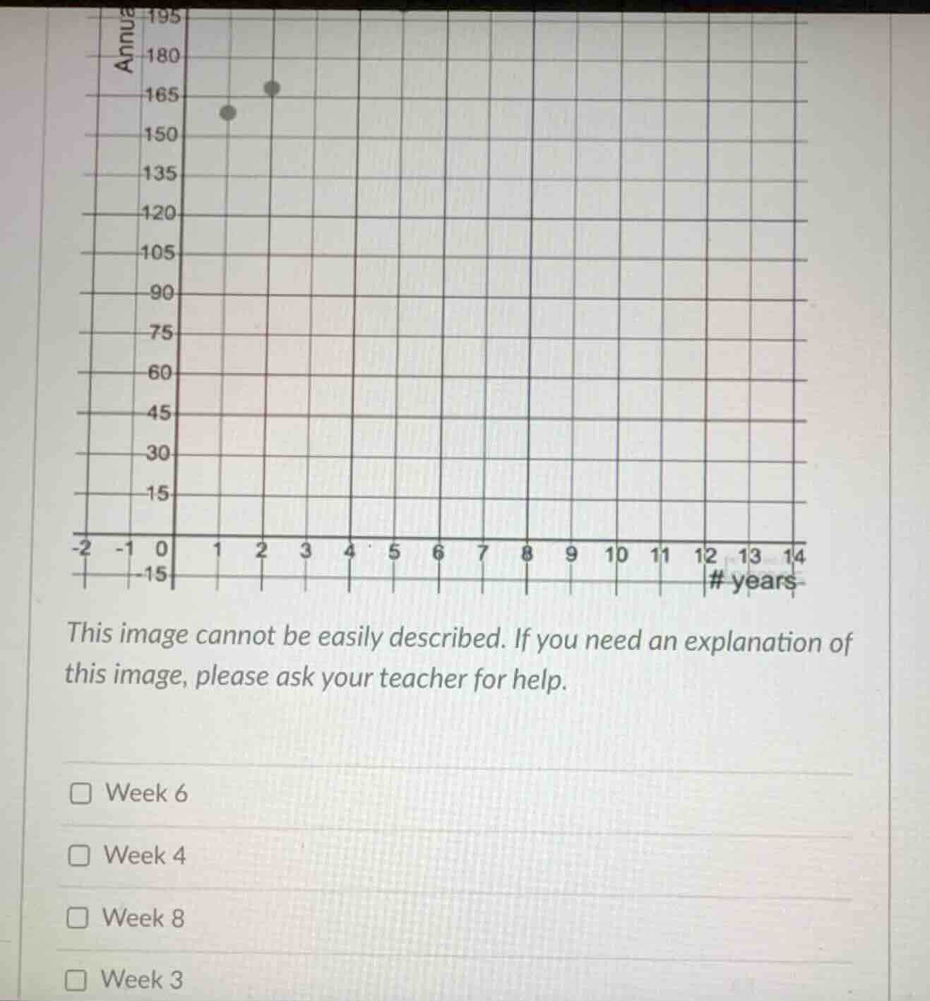
The graph shows a scatter plot with the horizontal axis labeled "# years" (ranging from -2 to 14) and the vertical axis labeled "Annual..." (ranging from -15 to 195). There are two data points plotted:
- One point is at \(x = 1.2\) (or approximately 1), \(y \approx 158\).
- Another point is at \(x = 2.2\) (or approximately 2), \(y \approx 168\).
Evaluate the options
The question options are:
- Week 6
- Week 4
- Week 8
- Week 3
However, the horizontal axis of the graph is labeled "# years" and the options refer to "Week". This indicates that the image is incomplete and lacks the full text of the word problem describing the relationship between the years, weeks, or a specific data point/outlier being asked about.
Without the full problem description, we cannot mathematically derive which specific week is correct. However, looking at the visual layout of typical school curriculum questions of this type, this is often a question about identifying an outlier or a specific data point from a table that was plotted incorrectly, or predicting a value. Since the question is incomplete, we provide a direct, clear response based on the visible options.

Snap & solve any problem in the app
Get step-by-step solutions on Sovi AI
Photo-based solutions with guided steps
Explore more problems and detailed explanations
Due to the incomplete question text in the image, the exact relationship between the plotted years and the "Week" options cannot be uniquely determined. Please provide the full text of the question for a complete step-by-step solution.