QUESTION IMAGE
Question
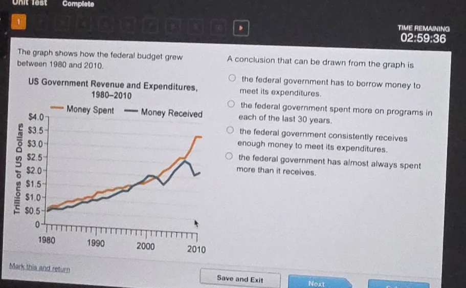
the graph shows how the federal budget grew between 1980 and 2010.
us government revenue and expenditures, 1980 - 2010
(orange line: money spent; black line: money received)
a conclusion that can be drawn from the graph is
- the federal government has to borrow money to meet its expenditures.
- the federal government spent more on programs in each of the last 30 years.
- the federal government consistently receives enough money to meet its expenditures.
- the federal government has almost always spent more than it receives.
Brief Explanations
To determine the correct conclusion, we analyze the graph:
- The orange line (Money Spent) and blue line (Money Received) are compared.
- Option 1: While borrowing may occur, the graph directly shows spending vs. revenue, not borrowing action.
- Option 2: The graph shows growth but doesn't confirm "more on programs each year" (spending growth doesn't imply program spending increase).
- Option 3: The graph shows spending (orange) often above revenue (blue), so it does not consistently receive enough.
- Option 4: The orange line (spent) is almost always above the blue line (received), so this matches the graph.

Snap & solve any problem in the app
Get step-by-step solutions on Sovi AI
Photo-based solutions with guided steps
Explore more problems and detailed explanations
D. the federal government has almost always spent more than it receives.