QUESTION IMAGE
Question
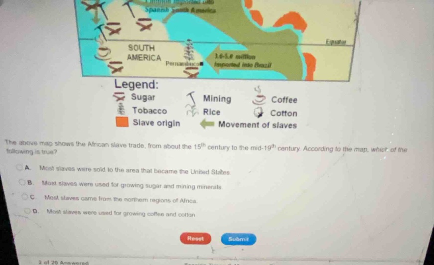
the above map shows the african slave trade, from about the 15^{th} century to the mid-19^{th} century. according to the map, which of the following is true?
a. most slaves were sold to the area that became the united states
b. most slaves were used for growing sugar and mining minerals.
c. most slaves came from the northern regions of africa.
d. most slaves were used for growing coffee and cotton.
<pre_analysis>
{
"quality": "clear",
"question_count": 1,
"skills_matched": [
"direct_cot",
"multiple_choice_formatter",
"explain_then_answer",
"tutor",
"mastery_adaptive_brevity"
],
"needs_drawing": false,
"concepts_used": [
"Historical Evidence"
],
"new_concepts": [
"Transatlantic Slave Trade",
"Colonial Plantation Economies"
],
"current_concepts": [
"Historical Evidence",
"Transatlantic Slave Trade",
"Colonial Plantation Economies"
]
}
</pre_analysis>
<reasoning>
Analyze the map data
Using the Historical Evidence knowledge point, we examine the visual data presented on the map:
- The green arrows representing the "Movement of slaves" show massive numbers going to South America: "3.6-5.0 million imported into Brazil" and "1 million imported into Spanish South America."
- The legend links various symbols to economic activities in these destination regions.
- The sugar symbol (crossed sugar canes) and mining symbol (pickaxe) are heavily concentrated in the regions receiving the largest volume of slaves (Brazil and Spanish South America).
Evaluate the options
- Option A: Incorrect. The map shows millions of slaves going to South America (Brazil alone received 3.6–5.0 million), which is far more than the number sent to the region that became the United States.
- Option B: Correct. The sugar and mining symbols dominate the areas in South America where the vast majority of slaves (totaling over 4.6–6.0 million) were imported.
- Option C: Incorrect. The orange shaded "Slave origin" regions are located along the west-central and southeastern coasts of Africa, not the northern regions.
- Option D: Incorrect. While coffee and cotton are listed in the legend, their symbols are much less prevalent in the high-import regions compared to sugar and mining.
</reasoning>
<answer>
<mcq-option>(A) Most slaves were sold to the area that became the United States.</mcq-option>
<mcq-correct>(B) Most slaves were used for growing sugar and mining minerals.</mcq-correct>
<mcq-option>(C) Most slaves came from the northern regions of Africa.</mcq-option>
<mcq-option>(D) Most slaves were used for growing coffee and cotton.</mcq-option>
</answer>
<post_analysis>
{
"subject": "Social Science",
"question_type": "Multiple Choice",
"knowledge_point": [
"Social Science",
"History",
"Transatlantic Slave Trade"
]
}
</post_analysis>

Snap & solve any problem in the app
Get step-by-step solutions on Sovi AI
Photo-based solutions with guided steps
Explore more problems and detailed explanations
<pre_analysis>
{
"quality": "clear",
"question_count": 1,
"skills_matched": [
"direct_cot",
"multiple_choice_formatter",
"explain_then_answer",
"tutor",
"mastery_adaptive_brevity"
],
"needs_drawing": false,
"concepts_used": [
"Historical Evidence"
],
"new_concepts": [
"Transatlantic Slave Trade",
"Colonial Plantation Economies"
],
"current_concepts": [
"Historical Evidence",
"Transatlantic Slave Trade",
"Colonial Plantation Economies"
]
}
</pre_analysis>
<reasoning>
Analyze the map data
Using the Historical Evidence knowledge point, we examine the visual data presented on the map:
- The green arrows representing the "Movement of slaves" show massive numbers going to South America: "3.6-5.0 million imported into Brazil" and "1 million imported into Spanish South America."
- The legend links various symbols to economic activities in these destination regions.
- The sugar symbol (crossed sugar canes) and mining symbol (pickaxe) are heavily concentrated in the regions receiving the largest volume of slaves (Brazil and Spanish South America).
Evaluate the options
- Option A: Incorrect. The map shows millions of slaves going to South America (Brazil alone received 3.6–5.0 million), which is far more than the number sent to the region that became the United States.
- Option B: Correct. The sugar and mining symbols dominate the areas in South America where the vast majority of slaves (totaling over 4.6–6.0 million) were imported.
- Option C: Incorrect. The orange shaded "Slave origin" regions are located along the west-central and southeastern coasts of Africa, not the northern regions.
- Option D: Incorrect. While coffee and cotton are listed in the legend, their symbols are much less prevalent in the high-import regions compared to sugar and mining.
</reasoning>
<answer>
<mcq-option>(A) Most slaves were sold to the area that became the United States.</mcq-option>
<mcq-correct>(B) Most slaves were used for growing sugar and mining minerals.</mcq-correct>
<mcq-option>(C) Most slaves came from the northern regions of Africa.</mcq-option>
<mcq-option>(D) Most slaves were used for growing coffee and cotton.</mcq-option>
</answer>
<post_analysis>
{
"subject": "Social Science",
"question_type": "Multiple Choice",
"knowledge_point": [
"Social Science",
"History",
"Transatlantic Slave Trade"
]
}
</post_analysis>