QUESTION IMAGE
Question
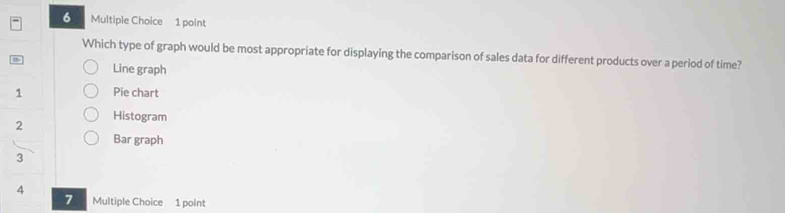
6 multiple choice 1 point
which type of graph would be most appropriate for displaying the comparison of sales data for different products over a period of time?
line graph
pie chart
histogram
bar graph
Analyze the data representation requirements
- Target: Comparison of sales data for different products over a period of time.
- Key factors: Multiple categories (different products) and temporal changes (over a period of time).
Evaluate the graph options
- Line graph: Ideal for showing trends and changes over time for one or more groups.
- Pie chart: Best for showing parts of a whole at a single point in time.
- Histogram: Used to show frequency distributions of continuous data.
- Bar graph: Best for comparing discrete categories at a single point in time.
Select the most appropriate graph type
- A line graph allows multiple lines (one for each product) to be plotted over the same time axis, making it the most effective choice for tracking and comparing trends over time.

Snap & solve any problem in the app
Get step-by-step solutions on Sovi AI
Photo-based solutions with guided steps
Explore more problems and detailed explanations
- Line graph (Correct answer)
- Pie chart
- Histogram
- Bar graph