QUESTION IMAGE
Question
Question was provided via image upload.
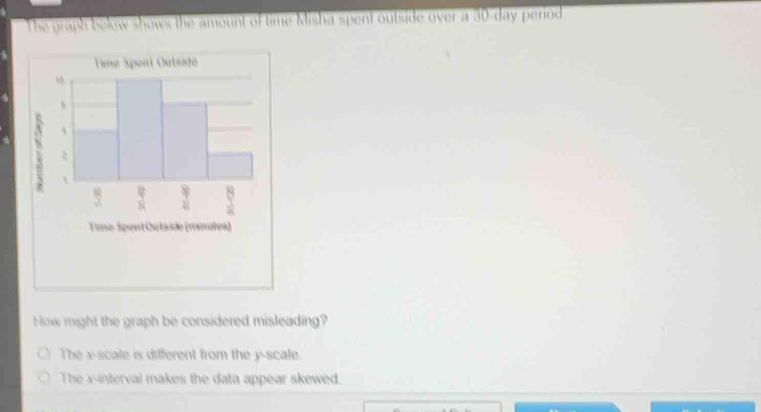
Analyze the graph's intervals
Using the Misleading Graphs knowledge point, we examine the horizontal axis ($x$-axis) representing "Time Spent Outside (minutes)". The intervals shown are:
- First bar: $0\text{--}30$ (width of 30)
- Second bar: $31\text{--}40$ (width of 10)
- Third bar: $41\text{--}50$ (width of 10)
- Fourth bar: $51\text{--}120$ (width of 70)
The intervals are inconsistent in width, which distorts the visual representation of the data distribution.
Evaluate the options
Using the Misleading Graphs knowledge point:
- Option 1: "The $x$-scale is different from the $y$-scale." This is standard for histograms and is not inherently misleading.
- Option 2: "The $x$-interval makes the data appear skewed." Because the intervals have unequal widths ($30$, $10$, $10$, and $70$ minutes), the shape of the distribution is distorted, artificially skewing the visual representation.

Snap & solve any problem in the app
Get step-by-step solutions on Sovi AI
Photo-based solutions with guided steps
Explore more problems and detailed explanations
- The x-scale is different from the y-scale.
- The x-interval makes the data appear skewed. (Correct answer)