QUESTION IMAGE
Question
total units produced
total units produced
graph 3
graph 4
total units produced
total units produced
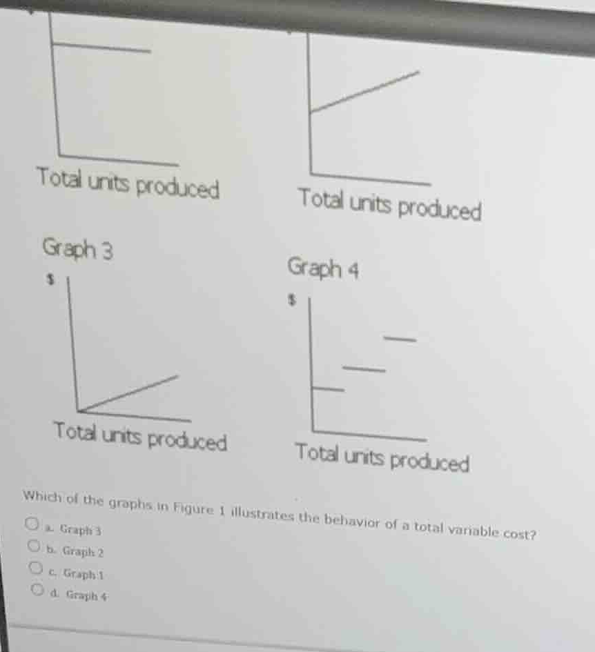
which of the graphs in figure 1 illustrates the behavior of a total variable cost?
a. graph 3
b. graph 2
c. graph 1
d. graph 4
Identify cost behavior types
Using the Variable Cost, Fixed Cost, and Mixed Cost knowledge points
- Graph 1 (top-left, implied) shows a constant horizontal line starting above zero, representing total fixed cost.
- Graph 2 (top-right, implied) shows a straight line starting above zero with a positive slope, representing total mixed cost.
- Graph 3 (bottom-left) shows a straight line starting at the origin \((0,0)\) with a positive slope, representing total variable cost.
- Graph 4 (bottom-right) shows a series of horizontal steps, representing step-variable or step-fixed cost.
Match to the question
Using the Variable Cost knowledge point
- The question asks which graph illustrates the behavior of a total variable cost.
- Total variable cost starts at zero when production is zero and increases proportionally with volume.
- Graph 3 correctly depicts this behavior.
- Graph 3 corresponds to option (a).

Snap & solve any problem in the app
Get step-by-step solutions on Sovi AI
Photo-based solutions with guided steps
Explore more problems and detailed explanations
- a. Graph 3 (Correct answer)
- b. Graph 2
- c. Graph 1
- d. Graph 4