QUESTION IMAGE
Question
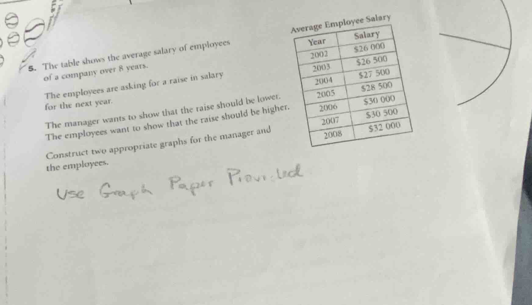
- the table shows the average salary of employees of a company over 8 years.
the employees are asking for a raise in salary for the next year.
the manager wants to show that the raise should be lower. the employees want to show that the raise should be higher.
construct two appropriate graphs for the manager and the employees.
use graph paper provided
<pre_analysis>
{
"quality": "clear",
"question_count": 1,
"skills_matched": [
"step_cot",
"explain_then_answer",
"tutor"
],
"needs_drawing": true,
"concepts_used": [
"Data Representation",
"Graph Interpretation"
],
"new_concepts": [
"Misleading Graphs",
"Scale Manipulation"
],
"current_concepts": [
"Data Representation",
"Graph Interpretation",
"Misleading Graphs",
"Scale Manipulation"
]
}
</pre_analysis>
<reasoning>
Analyze the data and objectives
We examine the given salary data over time:
- 2002: \$26,000
- 2003: \$26,500
- 2004: \$27,500
- 2005: \$28,500
- 2006: \$30,000
- 2007: \$30,500
- 2008: \$32,000
The manager wants to show that the raise should be lower, meaning they want to present the historical salary growth as steep and substantial.
The employees want to show that the raise should be higher, meaning they want to present the historical salary growth as flat, slow, or minimal.
We apply Data Representation and Graph Interpretation to manipulate the visual impact of the same dataset by changing the vertical scale.
Design the manager's graph
To make the salary increase look dramatic:
- Use a stretched vertical axis (y-axis).
- Start the y-axis close to the minimum value (e.g., truncate the axis to start at \$25,000 instead of \$0).
- This exaggerates the upward slope, making the growth look rapid.
Design the employees' graph
To make the salary increase look minimal:
- Use a compressed vertical axis (y-axis).
- Start the y-axis at \$0 and extend it well beyond the maximum value (e.g., up to \$80,000 or \$100,000).
- This flattens the curve, making the salary growth look very small and slow.
Formulate the construction instructions
We summarize the specific graphing strategies for both perspectives clearly and concisely.
</reasoning>
<answer>
To construct the two appropriate graphs, use the following scale manipulation strategies on your graph paper:
1. The Manager's Graph (Exaggerating Growth)
- Objective: Show a rapid, steep increase in salary to argue that past raises have been generous.
- Y-Axis Scale: Truncate the vertical axis. Start the y-axis at \$25,000** and end at **\$33,000, using small increments (e.g., \$1,000 per grid line).
- Visual Effect: The line graph will slope sharply upward, making the salary growth look dramatic.
2. The Employees' Graph (Minimizing Growth)
- Objective: Show a flat, slow increase in salary to argue that past raises have been insufficient.
- Y-Axis Scale: Use a complete scale with a large range. Start the y-axis at \$0** and extend it up to **\$80,000 or **\$100,000**, using large increments (e.g., \$10,000 or \$20,000 per grid line).
- Visual Effect: The line graph will look nearly flat, making the salary growth over the 8 years appear negligible.
</answer>
<plot>
{
"elements": [
{
"type": "text",
"params": [-8, 8, "Manager's Perspective (Truncated Scale)"],
"properties": {
"color": "#8C55F2",
"fixed": true
}
},
{
"type": "line",
"params": [[-9, -2], [-1, -2]],
"properties": {
"strokeColor": "#583C87",
"strokeWidth": 2
}
},
{
"type": "line",
"params": [[-9, -2], [-9, 7]],
"properties": {
"strokeColor": "#583C87",
"strokeWidth": 2
}
},
{
"type": "curve",
"params": [
{
"x": { "js": "t", "latex": "t" },
"y": { "js": "-2 + (t + 9) * 0.9", "latex": "y(t)" }
},…

Snap & solve any problem in the app
Get step-by-step solutions on Sovi AI
Photo-based solutions with guided steps
Explore more problems and detailed explanations
<pre_analysis>
{
"quality": "clear",
"question_count": 1,
"skills_matched": [
"step_cot",
"explain_then_answer",
"tutor"
],
"needs_drawing": true,
"concepts_used": [
"Data Representation",
"Graph Interpretation"
],
"new_concepts": [
"Misleading Graphs",
"Scale Manipulation"
],
"current_concepts": [
"Data Representation",
"Graph Interpretation",
"Misleading Graphs",
"Scale Manipulation"
]
}
</pre_analysis>
<reasoning>
Analyze the data and objectives
We examine the given salary data over time:
- 2002: \$26,000
- 2003: \$26,500
- 2004: \$27,500
- 2005: \$28,500
- 2006: \$30,000
- 2007: \$30,500
- 2008: \$32,000
The manager wants to show that the raise should be lower, meaning they want to present the historical salary growth as steep and substantial.
The employees want to show that the raise should be higher, meaning they want to present the historical salary growth as flat, slow, or minimal.
We apply Data Representation and Graph Interpretation to manipulate the visual impact of the same dataset by changing the vertical scale.
Design the manager's graph
To make the salary increase look dramatic:
- Use a stretched vertical axis (y-axis).
- Start the y-axis close to the minimum value (e.g., truncate the axis to start at \$25,000 instead of \$0).
- This exaggerates the upward slope, making the growth look rapid.
Design the employees' graph
To make the salary increase look minimal:
- Use a compressed vertical axis (y-axis).
- Start the y-axis at \$0 and extend it well beyond the maximum value (e.g., up to \$80,000 or \$100,000).
- This flattens the curve, making the salary growth look very small and slow.
Formulate the construction instructions
We summarize the specific graphing strategies for both perspectives clearly and concisely.
</reasoning>
<answer>
To construct the two appropriate graphs, use the following scale manipulation strategies on your graph paper:
1. The Manager's Graph (Exaggerating Growth)
- Objective: Show a rapid, steep increase in salary to argue that past raises have been generous.
- Y-Axis Scale: Truncate the vertical axis. Start the y-axis at \$25,000** and end at **\$33,000, using small increments (e.g., \$1,000 per grid line).
- Visual Effect: The line graph will slope sharply upward, making the salary growth look dramatic.
2. The Employees' Graph (Minimizing Growth)
- Objective: Show a flat, slow increase in salary to argue that past raises have been insufficient.
- Y-Axis Scale: Use a complete scale with a large range. Start the y-axis at \$0** and extend it up to **\$80,000 or **\$100,000**, using large increments (e.g., \$10,000 or \$20,000 per grid line).
- Visual Effect: The line graph will look nearly flat, making the salary growth over the 8 years appear negligible.
</answer>
<plot>
{
"elements": [
{
"type": "text",
"params": [-8, 8, "Manager's Perspective (Truncated Scale)"],
"properties": {
"color": "#8C55F2",
"fixed": true
}
},
{
"type": "line",
"params": [[-9, -2], [-1, -2]],
"properties": {
"strokeColor": "#583C87",
"strokeWidth": 2
}
},
{
"type": "line",
"params": [[-9, -2], [-9, 7]],
"properties": {
"strokeColor": "#583C87",
"strokeWidth": 2
}
},
{
"type": "curve",
"params": [
{
"x": { "js": "t", "latex": "t" },
"y": { "js": "-2 + (t + 9) * 0.9", "latex": "y(t)" }
},
-9,
-1
],
"properties": {
"strokeColor": "#8C55F2",
"strokeWidth": 3
}
},
{
"type": "text",
"params": [2, 8, "Employees' Perspective (Full Scale)"],
"properties": {
"color": "#F2557F",
"fixed": true
}
},
{
"type": "line",
"params": [[1, -2], [9, -2]],
"properties": {
"strokeColor": "#D92B54",
"strokeWidth": 2
}
},
{
"type": "line",
"params": [[1, -2], [1, 7]],
"properties": {
"strokeColor": "#D92B54",
"strokeWidth": 2
}
},
{
"type": "curve",
"params": [
{
"x": { "js": "t", "latex": "t" },
"y": { "js": "0.5 + (t - 1) * 0.1", "latex": "y(t)" }
},
1,
9
],
"properties": {
"strokeColor": "#F2557F",
"strokeWidth": 3
}
}
],
"timestamps": [0.5, 1.0]
}
</plot>
<post_analysis>
{
"subject": "Mathematics",
"question_type": "Free Response",
"knowledge_point": [
"Mathematics",
"Statistics",
"Data Representation"
]
}
</post_analysis>