QUESTION IMAGE
Question
select the correct answer from the drop-down menu.
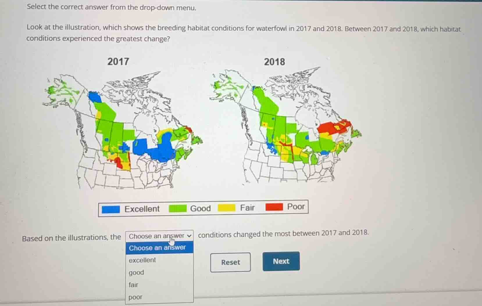
look at the illustration, which shows the breeding habitat conditions for waterfowl in 2017 and 2018. between 2017 and 2018, which habitat conditions experienced the greatest change?
based on the illustrations, the choose an answer conditions changed the most between 2017 and 2018.
options:
excellent
good
fair
poor
<pre_analysis>
{
"quality": "clear",
"question_count": 1,
"skills_matched": [
"direct_cot",
"multiple_choice_formatter",
"explain_then_answer",
"tutor"
],
"needs_drawing": false,
"concepts_used": [
"Visual Text Integration",
"Visual Communication",
"Information Graphics"
],
"new_concepts": [
"Data Map Analysis",
"Environmental Data Interpretation"
],
"current_concepts": [
"Visual Text Integration",
"Visual Communication",
"Information Graphics",
"Data Map Analysis",
"Environmental Data Interpretation"
]
}
</pre_analysis>
<reasoning>
Analyze the visual data for 2017
Using the Visual Communication and Information Graphics knowledge points, we examine the map for 2017. The blue color represents "Excellent" conditions. In 2017, there are large, prominent blue regions spanning across the eastern and northern parts of the surveyed breeding habitat.
Analyze the visual data for 2018
Using the Visual Text Integration knowledge point, we compare the 2017 map with the 2018 map. In 2018, the blue "Excellent" regions have almost completely disappeared, leaving only a tiny speck of blue in the south-central area.
Compare the changes across all categories
- Excellent (Blue): Goes from very large, widespread coverage in 2017 to almost non-existent in 2018. This represents a massive reduction in area.
- Good (Green): Remains widely distributed across both maps, covering the majority of the northern and western regions in both years.
- Fair (Yellow): Shows minor shifts in distribution but maintains a similar overall footprint.
- Poor (Red): Shows some expansion in the eastern and central regions, but the total area change is much smaller than the loss of the blue region.
Determine the greatest change
The most dramatic visual difference between the two maps is the near-total disappearance of the blue "Excellent" habitat conditions. Therefore, the "excellent" conditions experienced the greatest change.
</reasoning>
<answer>
<mcq-correct>excellent</mcq-correct>
<mcq-option>good</mcq-option>
<mcq-option>fair</mcq-option>
<mcq-option>poor</mcq-option>
</answer>
<post_analysis>
{
"subject": "Natural Science",
"question_type": "Multiple Choice",
"knowledge_point": [
"Natural Science",
"Environmental Science",
"Data Map Analysis"
]
}
</post_analysis>

Snap & solve any problem in the app
Get step-by-step solutions on Sovi AI
Photo-based solutions with guided steps
Explore more problems and detailed explanations
<pre_analysis>
{
"quality": "clear",
"question_count": 1,
"skills_matched": [
"direct_cot",
"multiple_choice_formatter",
"explain_then_answer",
"tutor"
],
"needs_drawing": false,
"concepts_used": [
"Visual Text Integration",
"Visual Communication",
"Information Graphics"
],
"new_concepts": [
"Data Map Analysis",
"Environmental Data Interpretation"
],
"current_concepts": [
"Visual Text Integration",
"Visual Communication",
"Information Graphics",
"Data Map Analysis",
"Environmental Data Interpretation"
]
}
</pre_analysis>
<reasoning>
Analyze the visual data for 2017
Using the Visual Communication and Information Graphics knowledge points, we examine the map for 2017. The blue color represents "Excellent" conditions. In 2017, there are large, prominent blue regions spanning across the eastern and northern parts of the surveyed breeding habitat.
Analyze the visual data for 2018
Using the Visual Text Integration knowledge point, we compare the 2017 map with the 2018 map. In 2018, the blue "Excellent" regions have almost completely disappeared, leaving only a tiny speck of blue in the south-central area.
Compare the changes across all categories
- Excellent (Blue): Goes from very large, widespread coverage in 2017 to almost non-existent in 2018. This represents a massive reduction in area.
- Good (Green): Remains widely distributed across both maps, covering the majority of the northern and western regions in both years.
- Fair (Yellow): Shows minor shifts in distribution but maintains a similar overall footprint.
- Poor (Red): Shows some expansion in the eastern and central regions, but the total area change is much smaller than the loss of the blue region.
Determine the greatest change
The most dramatic visual difference between the two maps is the near-total disappearance of the blue "Excellent" habitat conditions. Therefore, the "excellent" conditions experienced the greatest change.
</reasoning>
<answer>
<mcq-correct>excellent</mcq-correct>
<mcq-option>good</mcq-option>
<mcq-option>fair</mcq-option>
<mcq-option>poor</mcq-option>
</answer>
<post_analysis>
{
"subject": "Natural Science",
"question_type": "Multiple Choice",
"knowledge_point": [
"Natural Science",
"Environmental Science",
"Data Map Analysis"
]
}
</post_analysis>