QUESTION IMAGE
Question
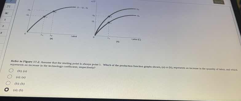
refer to figure 17-2. assume that the starting point is always point 1. which of the production function graphs shown, (a) or (b), represents an increase in the quantity of labor, and which represents an increase in the technology coefficient, respectively?
(b); (a)
(a); (a)
(b); (b)
(a); (b)
Analyze the effect of an increase in the quantity of labor
An increase in the quantity of labor represents a movement along a single production function curve. Starting at point 1 on graph (a), increasing labor from \(L_1\) to \(L_2\) moves the economy along the curve \(Q = f(T, K, L)\) to point 2, resulting in an increase in output from \(Q_1\) to \(Q_2\). Thus, graph (a) represents an increase in the quantity of labor.
Analyze the effect of an increase in the technology coefficient
An increase in the technology coefficient shifts the entire production function curve upward, meaning more output can be produced with the same amount of labor. Starting at point 1 on the lower curve \(Q_A\) in graph (b), with labor held constant at \(L_1\), an increase in technology shifts the curve up to \(Q_B\), moving the economy vertically to point 2 and increasing output from \(Q_1\) to \(Q_2\). Thus, graph (b) represents an increase in the technology coefficient.
Match the respective order
The question asks which graph represents an increase in the quantity of labor, and which represents an increase in the technology coefficient, respectively.
- Increase in quantity of labor: (a)
- Increase in technology coefficient: (b)
This corresponds to the combination (a); (b).

Snap & solve any problem in the app
Get step-by-step solutions on Sovi AI
Photo-based solutions with guided steps
Explore more problems and detailed explanations
- (b); (a)
- (a); (a)
- (b); (b)
- (a); (b) (Correct answer)