QUESTION IMAGE
Question
Question was provided via image upload.
Identify the data values
Using the Pie Chart Interpretation knowledge point
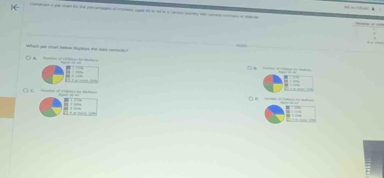
The problem asks us to identify the correct pie chart representing the given data. Although the data table on the far right is partially cut off, we can read the percentages directly from the legends of the four options to find the correct distribution:
- Option A: 1: 21%, 2: 30%, 3: 15%, 4 or more: 34%
- Option B: 1: 21%, 2: 30%, 3: 15%, 4 or more: 34% (with different visual slice sizes)
- Option C: 1: 21%, 2: 30%, 3: 15%, 4 or more: 34%
- Option D: 1: 30%, 2: 21%, 3: 15%, 4 or more: 34%
Let's analyze the correct visual proportions for the percentages:
- Category 1 (blue slice): 21% (slightly less than a quarter, which is 25%)
- Category 2 (red slice): 30% (slightly more than a quarter, 25%)
- Category 3 (yellow slice): 15% (noticeably smaller than a quarter)
- Category 4 or more (green slice): 34% (about one-third of the circle, larger than a quarter)
Compare the visual slices
Using the Pie Chart Interpretation knowledge point
Let's inspect the visual sizes of the slices in each option:
- In Option A:
- Blue slice (1): represents 21%, but visually it is drawn as a quarter (25%) or larger.
- Red slice (2): represents 30%, but visually it is smaller than the blue slice. This is incorrect.
- In Option B:
- Blue slice (1): represents 21%, but visually it is drawn as a quarter (25%).
- Red slice (2): represents 30%, but visually it is smaller than the blue slice. This is incorrect.
- In Option C:
- Blue slice (1): represents 21%, which is correctly shown as slightly less than a quarter.
- Red slice (2): represents 30%, which is correctly shown as larger than the blue slice (more than a quarter).
- Green slice (4 or more): represents 34%, which is the largest slice.
- Yellow slice (3): represents 15%, which is the smallest slice.
This matches the proportions perfectly.
- In Option D:
- The percentages in the legend are swapped (1 is 30%, 2 is 21%), which does not match the original distribution.

Snap & solve any problem in the app
Get step-by-step solutions on Sovi AI
Photo-based solutions with guided steps
Explore more problems and detailed explanations
- (A) Pie chart with incorrect slice proportions
- (B) Pie chart with incorrect slice proportions
- (C) Pie chart with correct slice proportions matching the percentages: 1 (21%), 2 (30%), 3 (15%), 4 or more (34%) (Correct answer)
- (D) Pie chart with incorrect legend percentages