QUESTION IMAGE
Question
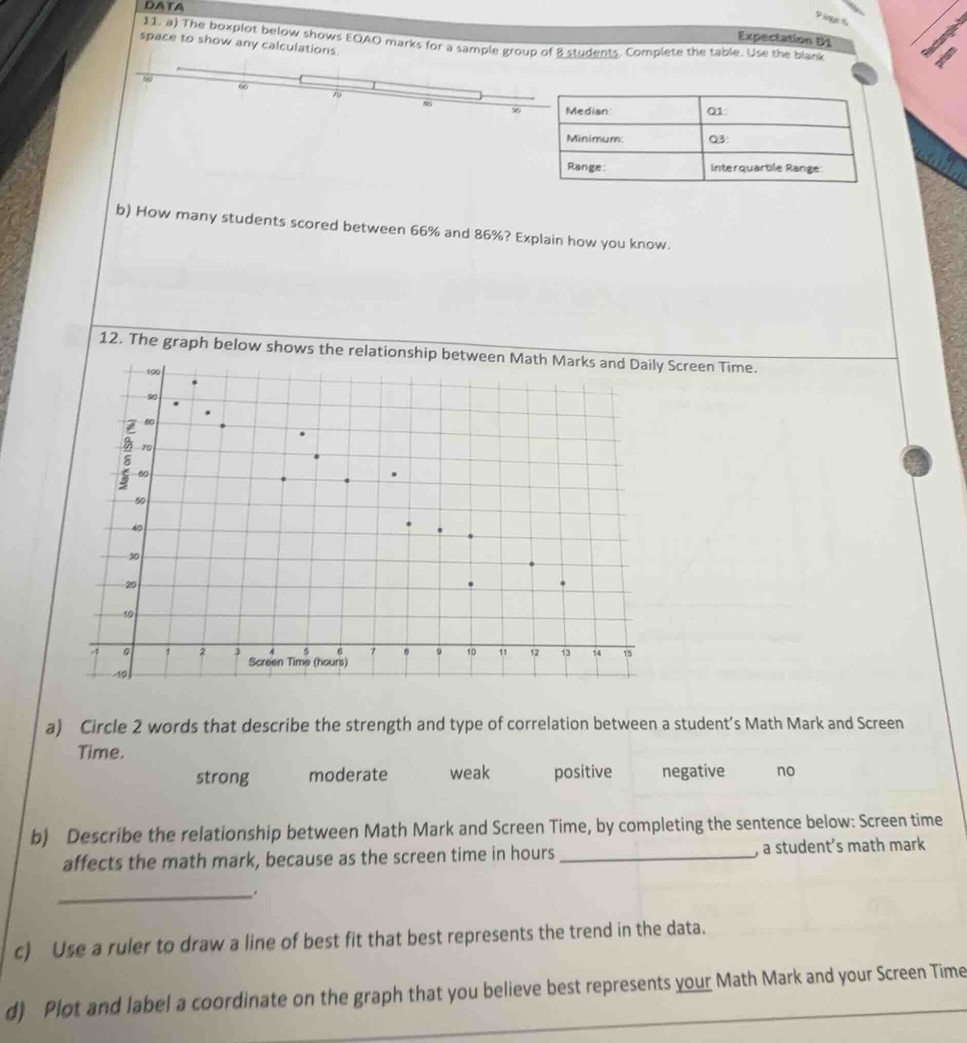
- a) the boxplot below shows eqao marks for a sample group of 8 students. complete the table. use the blank space to show any calculations.
median:
minimum:
range:
q1:
q3:
interquartile range:
b) how many students scored between 66% and 86%? explain how you know.
- the graph below shows the relationship between math marks and daily screen time.
a) circle 2 words that describe the strength and type of correlation between a students math mark and screen time.
strong moderate weak positive negative no
b) describe the relationship between math mark and screen time, by completing the sentence below: screen time affects the math mark, because as the screen time in hours ________, a students math mark ________.
c) use a ruler to draw a line of best fit that best represents the trend in the data.
d) plot and label a coordinate on the graph that you believe best represents your math mark and your screen time.
<pre_analysis>
{
"quality": "clear",
"question_count": 6,
"skills_matched": [
"step_cot",
"explain_then_answer",
"quick"
],
"needs_drawing": false,
"concepts_used": [],
"new_concepts": [
"Boxplot Interpretation",
"Quartiles and Range",
"Scatter Plot Correlation"
],
"current_concepts": [
"Boxplot Interpretation",
"Quartiles and Range",
"Scatter Plot Correlation"
]
}
</pre_analysis>
<reasoning>
Analyze the boxplot values for Question 11a
\[
\]
Determine the number of students for Question 11b
\[
\]
Analyze the scatter plot for Question 12
\[
\]
</reasoning>
<answer>
Question 11
a) Completed Table
- Median: \(73\%\)
- Minimum: \(56\%\)
- Range: \(36\%\)
- Q1: \(66\%\)
- Q3: \(86\%\)
- Interquartile Range: \(20\%\)
b) Number of Students
4 students.
** The interval from \(66\%\) to \(86\%\) represents the range from the first quartile (\(Q_1\)) to the third quartile (\(Q_3\)). By definition, this middle box of a boxplot contains exactly \(50\%\) of the data. Since there are \(8\) students in total, \(50\%\) of \(8\) is \(4\) students.
---
Question 12
a) Correlation Description
- strong
- negative
b) Relationship Sentence
Screen time affects the math mark, because as the screen time in hours increases, a student's math mark decreases.
c) Line of Best Fit
(To draw the line of best fit, place a ruler so that it passes through the center of the plotted points, with roughly an equal number of points above and below the line, following the downward trend from the top-left to the bottom-right).
d) Personal Coordinate
(Plot a point that aligns with the negative trend shown on the graph. For example, if your daily screen time is \(2\) hours, a corresponding mark on the trend line would be approximately \(85\%\), represented by the coordinate \((2, 85)\)).
</answer>
<post_analysis>
{
"subject": "Mathematics",
"question_type": "Multi-part",
"knowledge_point": [
"Mathematics",
"Statistics",
"Boxplot Interpretation"
]
}
</post_analysis>

Snap & solve any problem in the app
Get step-by-step solutions on Sovi AI
Photo-based solutions with guided steps
Explore more problems and detailed explanations
** The interval from \(66\%\) to \(86\%\) represents the range from the first quartile (\(Q_1\)) to the third quartile (\(Q_3\)). By definition, this middle box of a boxplot contains exactly \(50\%\) of the data. Since there are \(8\) students in total, \(50\%\) of \(8\) is \(4\) students.
---
Question 12
a) Correlation Description
- strong
- negative
b) Relationship Sentence
Screen time affects the math mark, because as the screen time in hours increases, a student's math mark decreases.
c) Line of Best Fit
(To draw the line of best fit, place a ruler so that it passes through the center of the plotted points, with roughly an equal number of points above and below the line, following the downward trend from the top-left to the bottom-right).
d) Personal Coordinate
(Plot a point that aligns with the negative trend shown on the graph. For example, if your daily screen time is \(2\) hours, a corresponding mark on the trend line would be approximately \(85\%\), represented by the coordinate \((2, 85)\)).
</answer>
<post_analysis>
{
"subject": "Mathematics",
"question_type": "Multi-part",
"knowledge_point": [
"Mathematics",
"Statistics",
"Boxplot Interpretation"
]
}
</post_analysis>